|
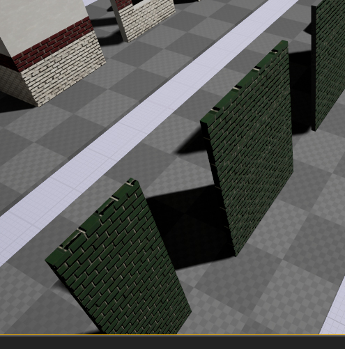
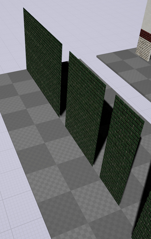
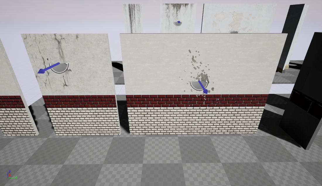
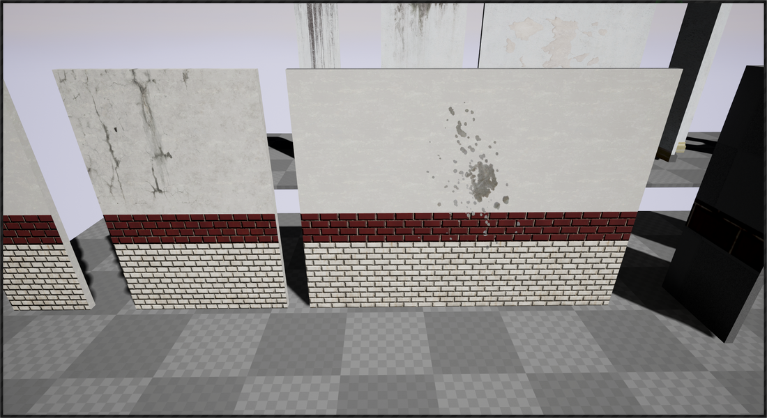
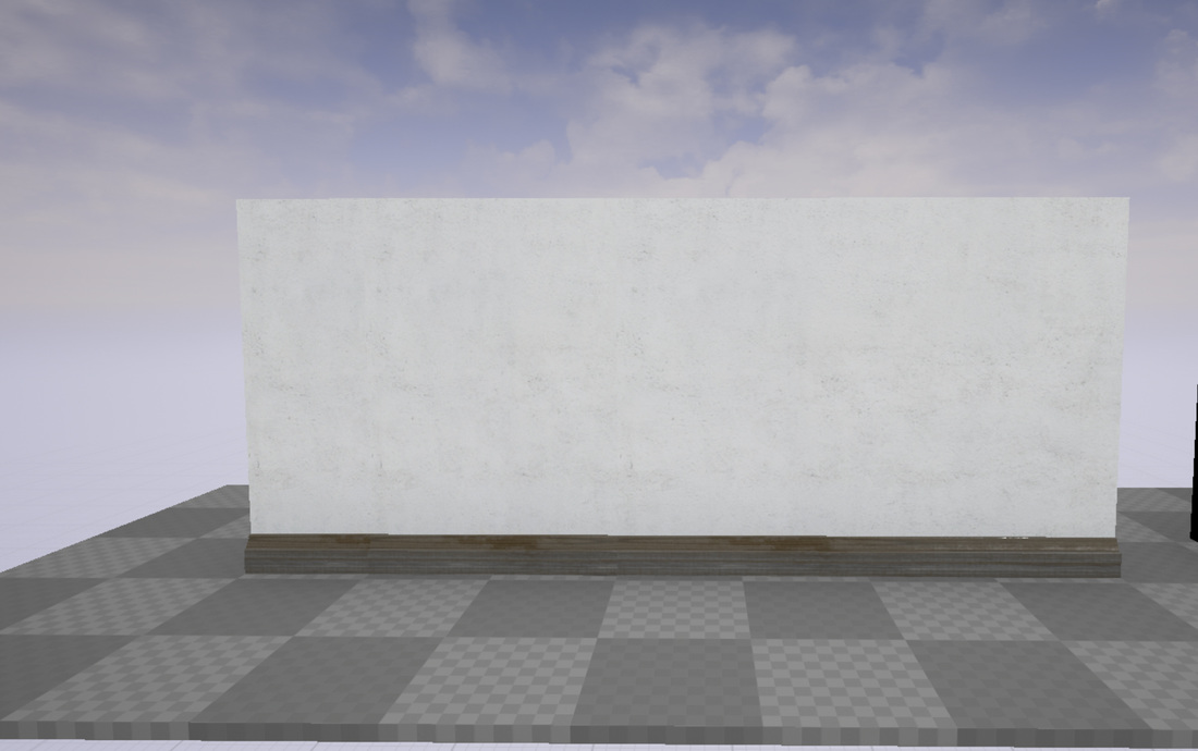
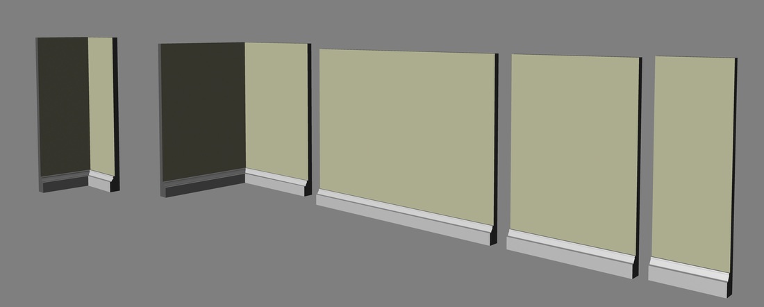
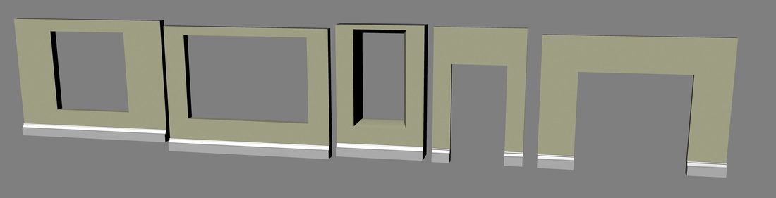
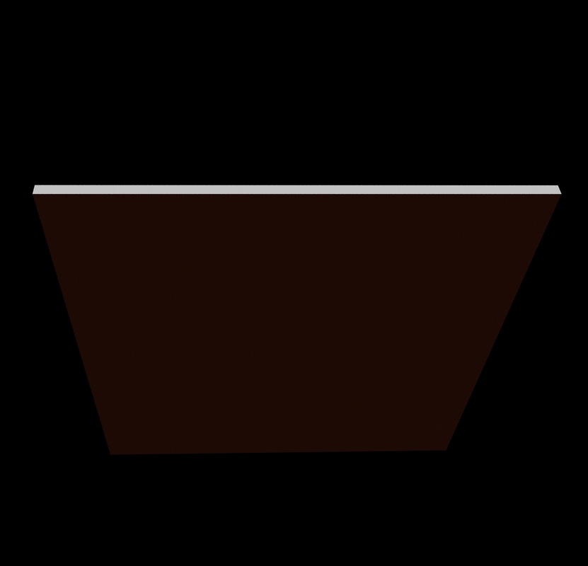
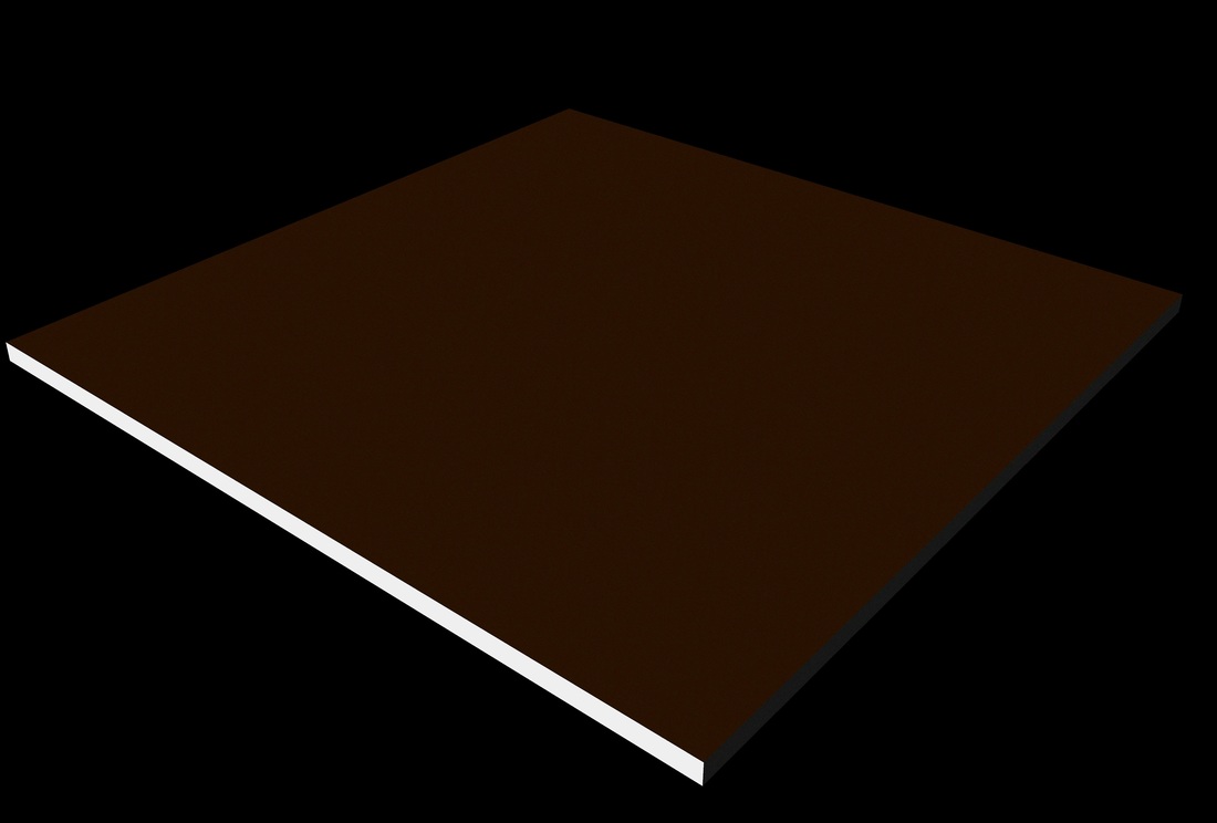
I wanted feedback on how I could improve my modular pack I submitted it to the online collage forum for reviews. I got a few reviews back very quickly, shown in the photo below 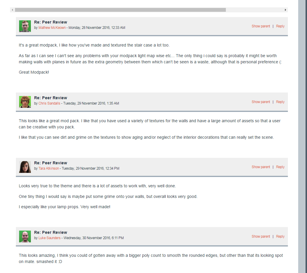 The overall feedback to my modular pack were good there were a few options on how to improve the look and performance. Matthew recommended that I turn most of the walls into planes as the geometry would be extra for the game engine to build and would not be required. So what I did was I went back into Maya and removed the faces of the walls that would not be seen by the user and imported it into the unreal. As I didn't change the UV I could use the old material from the old walls as both use the same texture coordinates. in the photo below you can see the old walls against the new walls. another recommendation which was made by Tara was the plastered walls were a bit plain and could do with some grime and dirt on them. As I want to keep the walls plain to stop a repetition of the same grime I decided on using decal material was the best way forward. What I did was download a few decal textures by textures.com and import them making sure they were in TGA or PNG format. once in unreal, I created a material from the textures and opened it up and changed the 'material domain' to 'deferred decal' and then connected the alpha channel of the texture to the 'opacity' to make the alpha channel transparent. 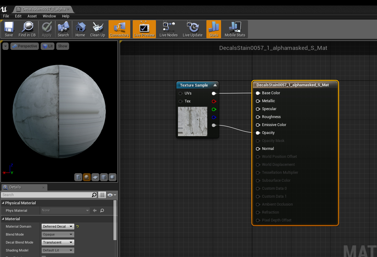 once I had the materials made I went to the visual effect tab and dragged a 'deferred decal' on to the mesh, then applied the decal material and arranged it on the model as shown in the photo below the after effect of applying the decals 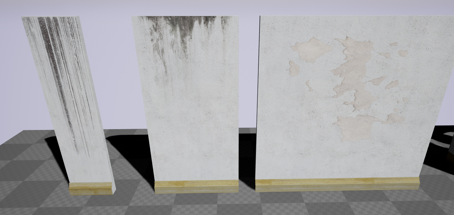 The final recommendation was from Luke who said I could use a higher poly count to make some of the models more smoother. I decided not to listen to this advice as I am making a game of virtual reality and I need to keep the poly count as low as possible as I need the game to run in a continuous 120fps (frames per second) and high poly models will effect the fps and performance.
1 Comment
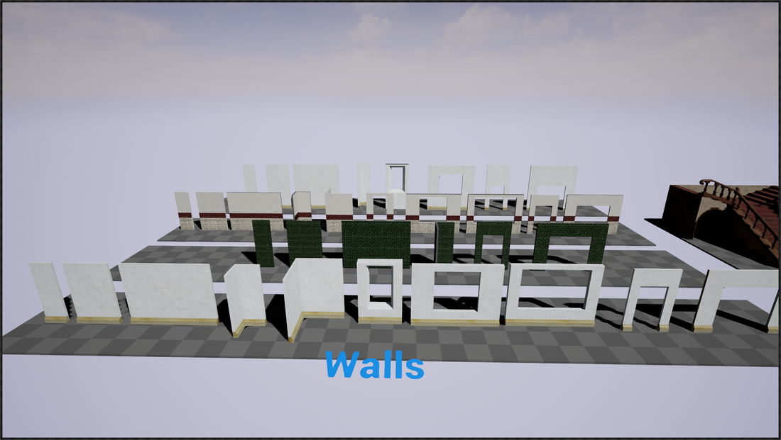
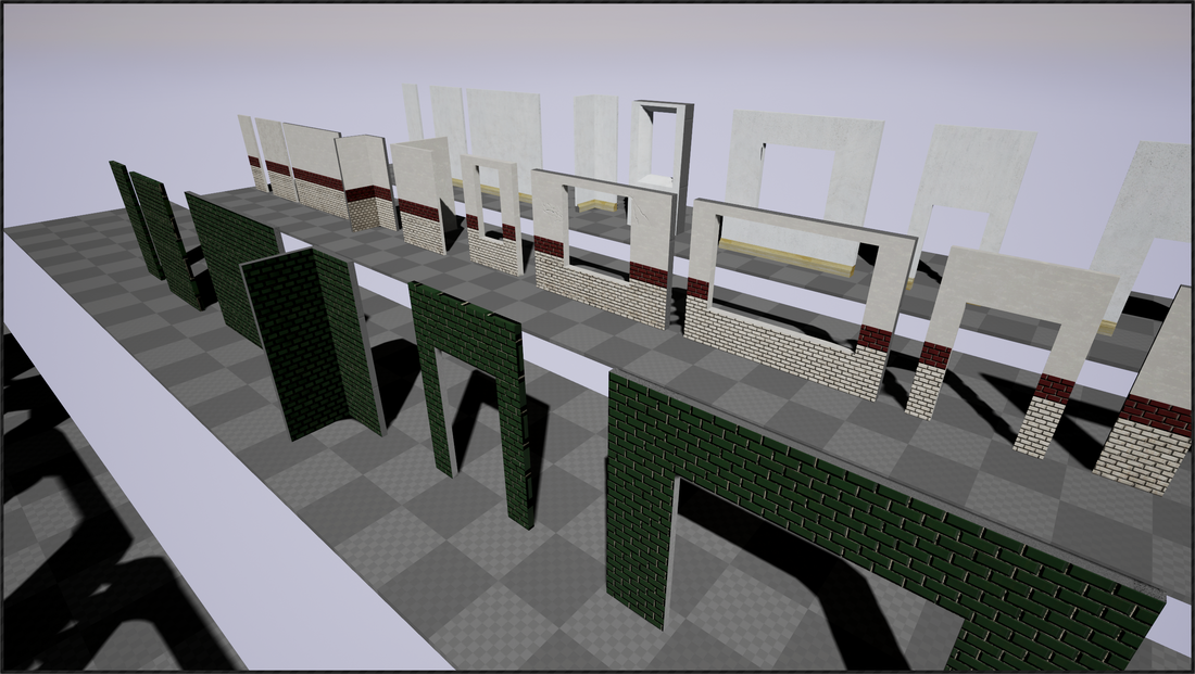
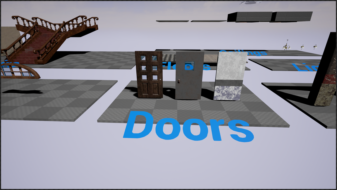
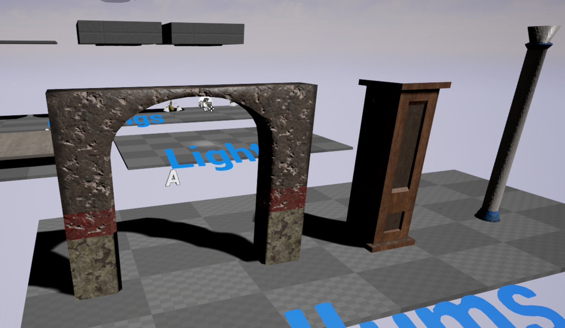
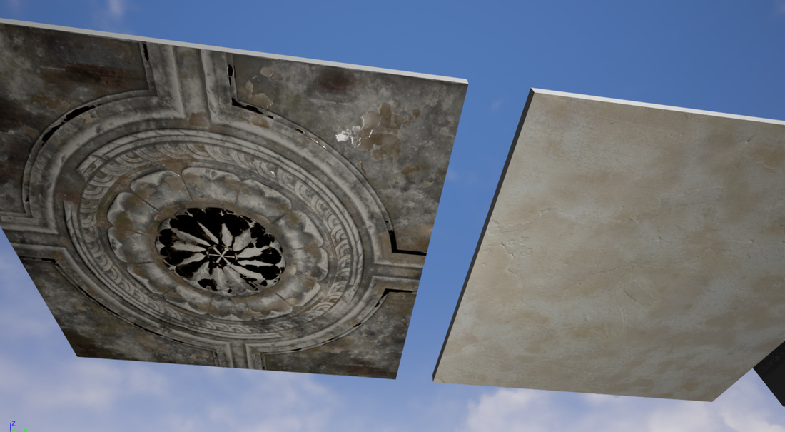
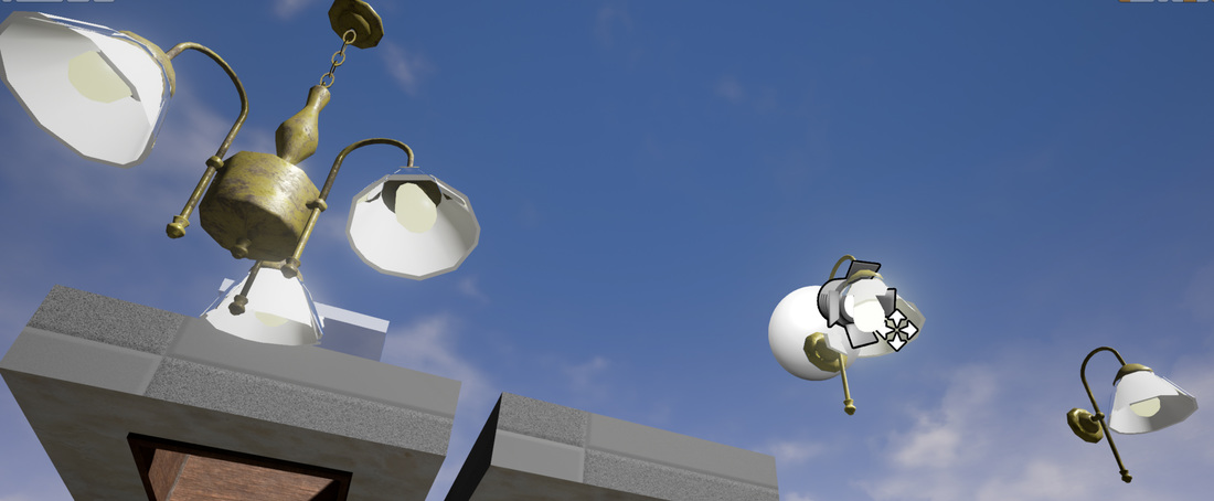
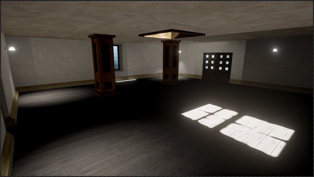
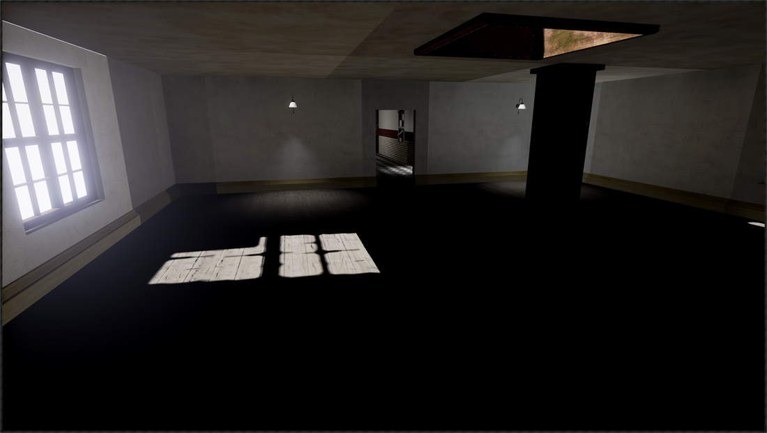
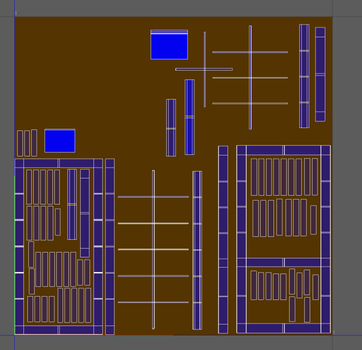
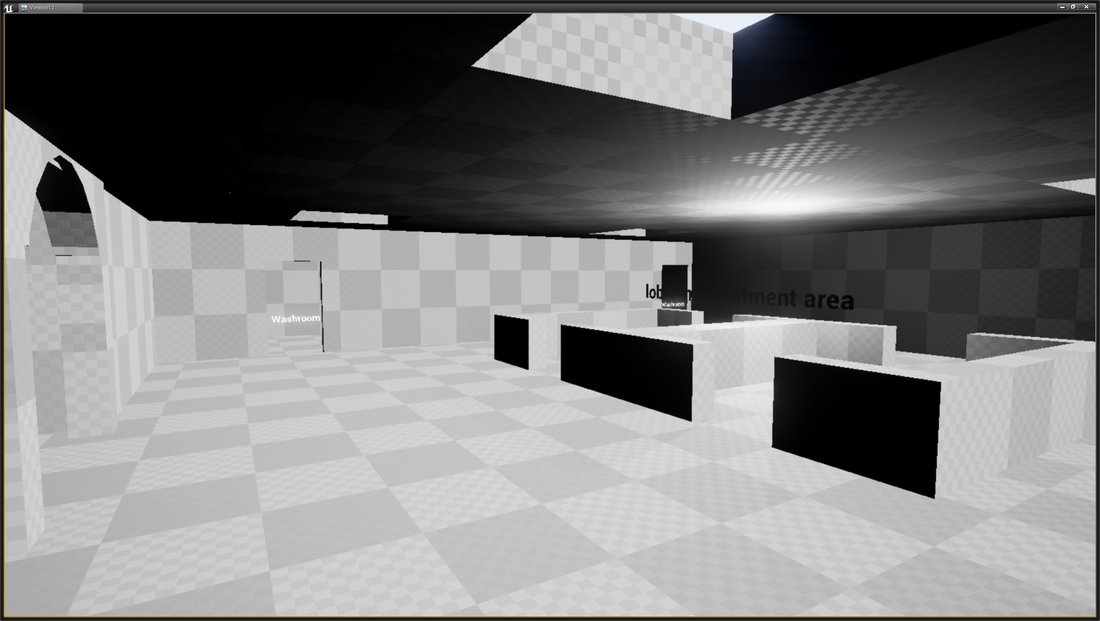
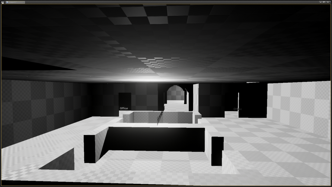
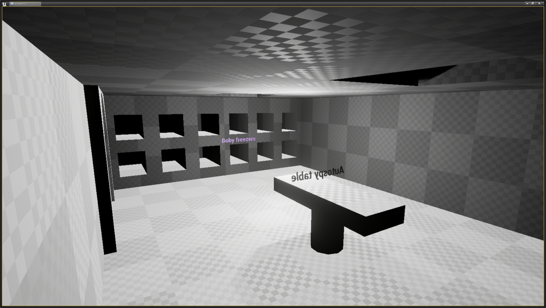
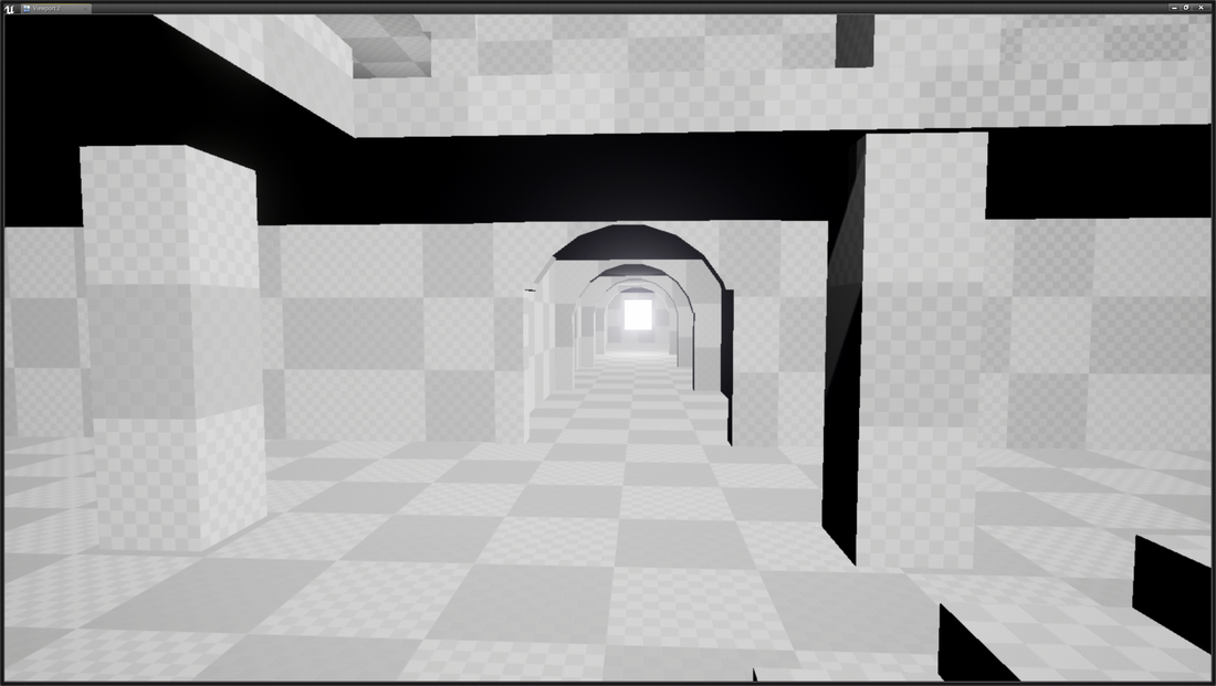
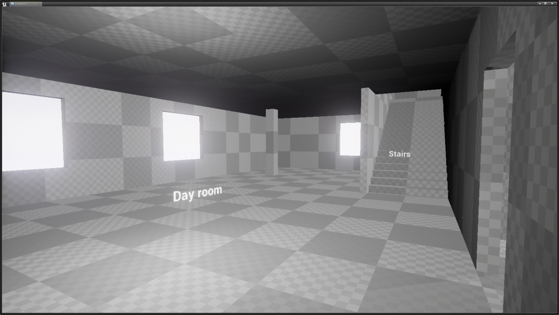
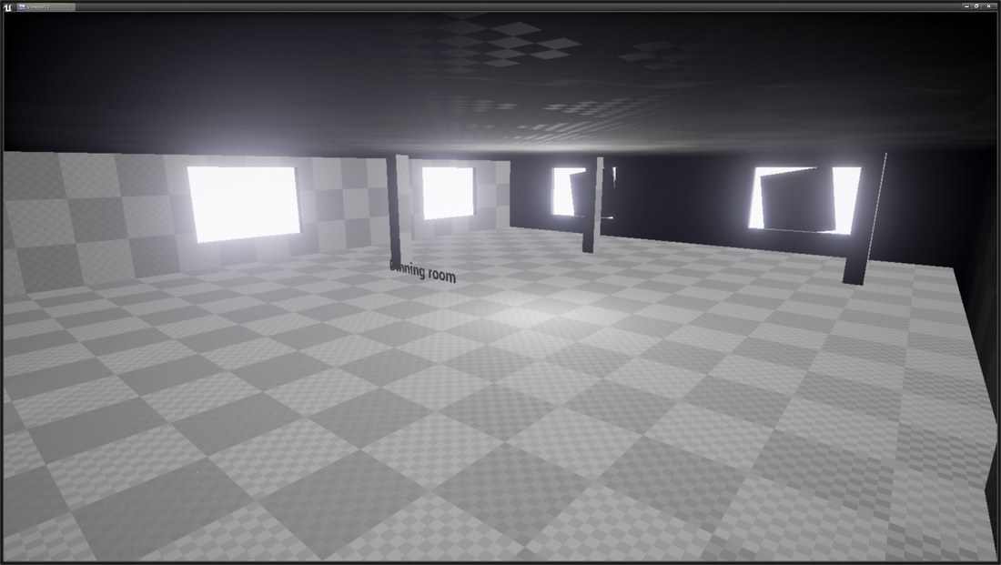
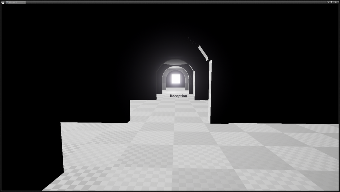
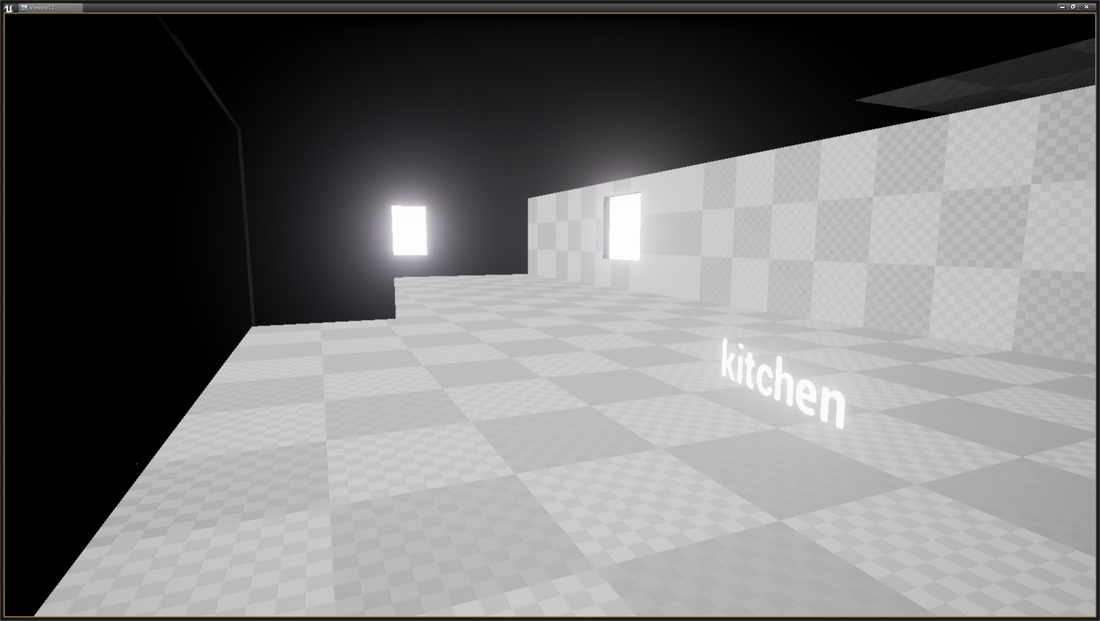
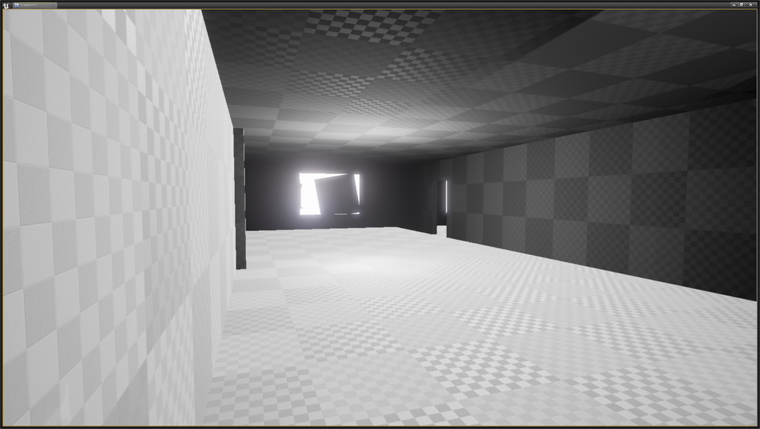
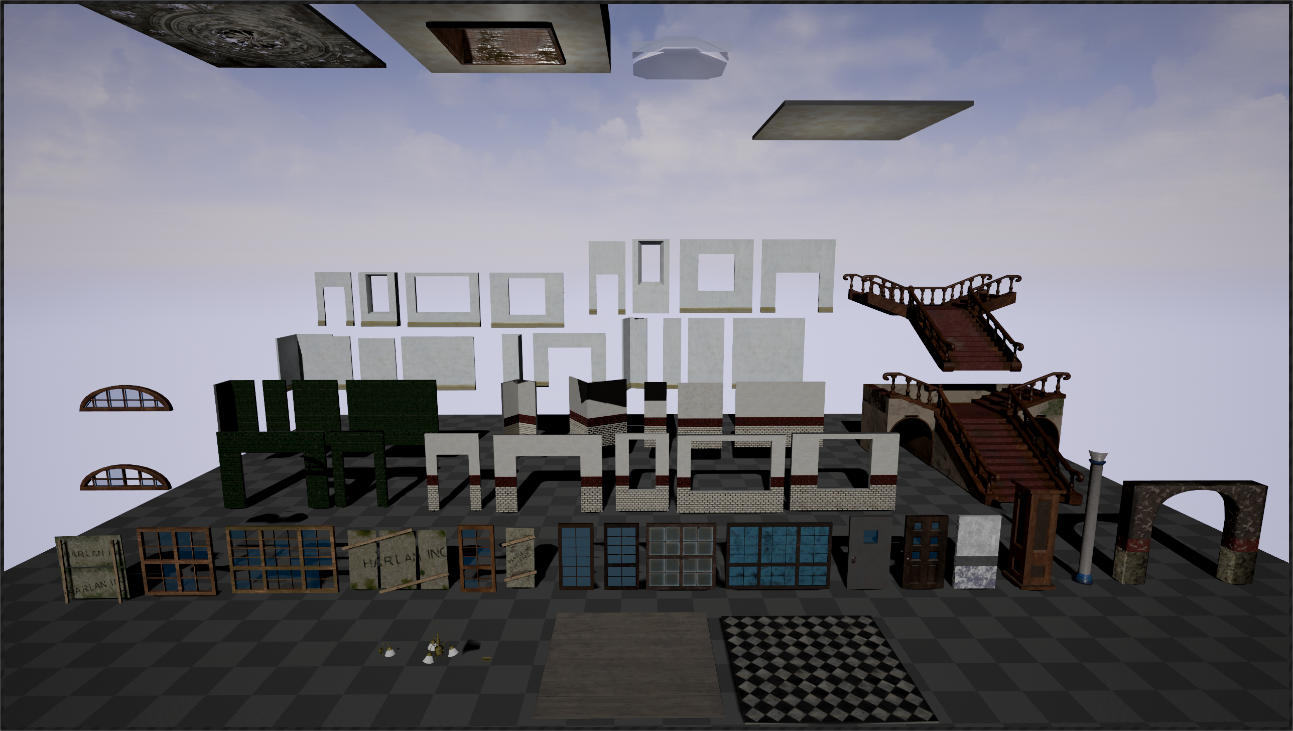 An overview of all the 3D models made for the modular pack More photos of the modular pack in there categories finally a few photos of a room to show a small example of what can be achieved with the modular pack.
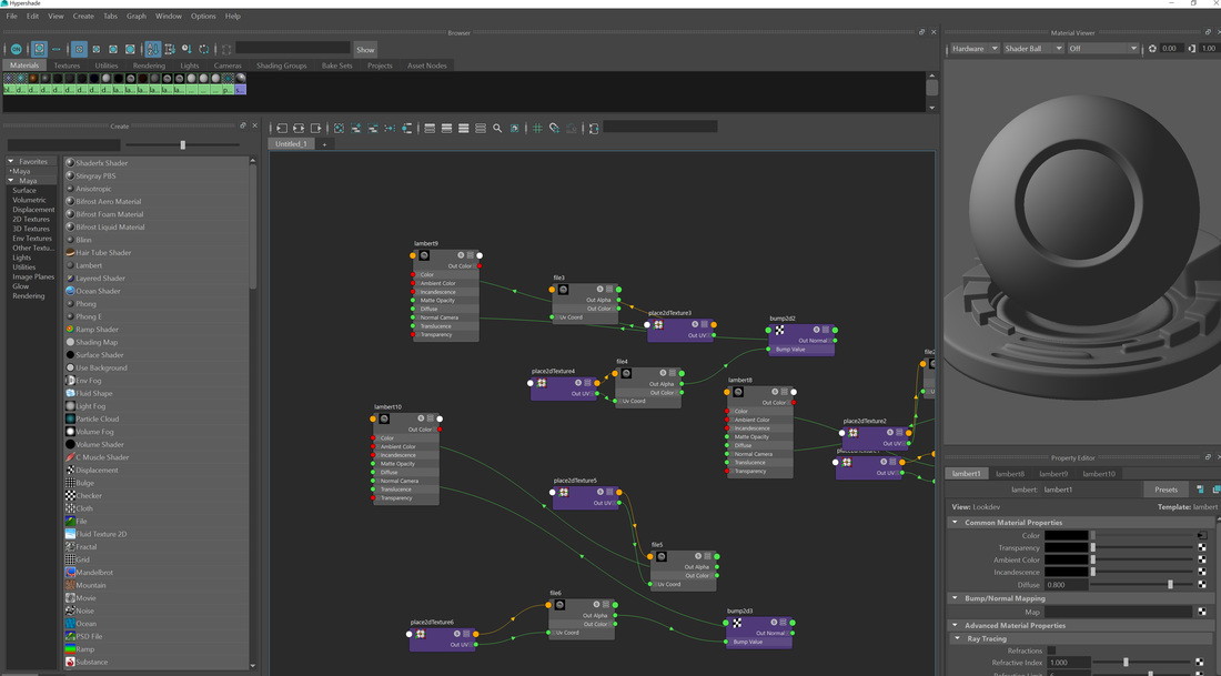
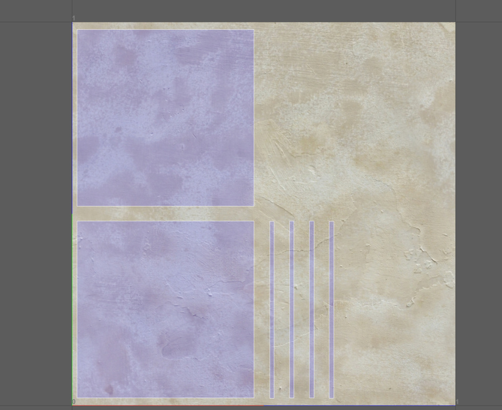
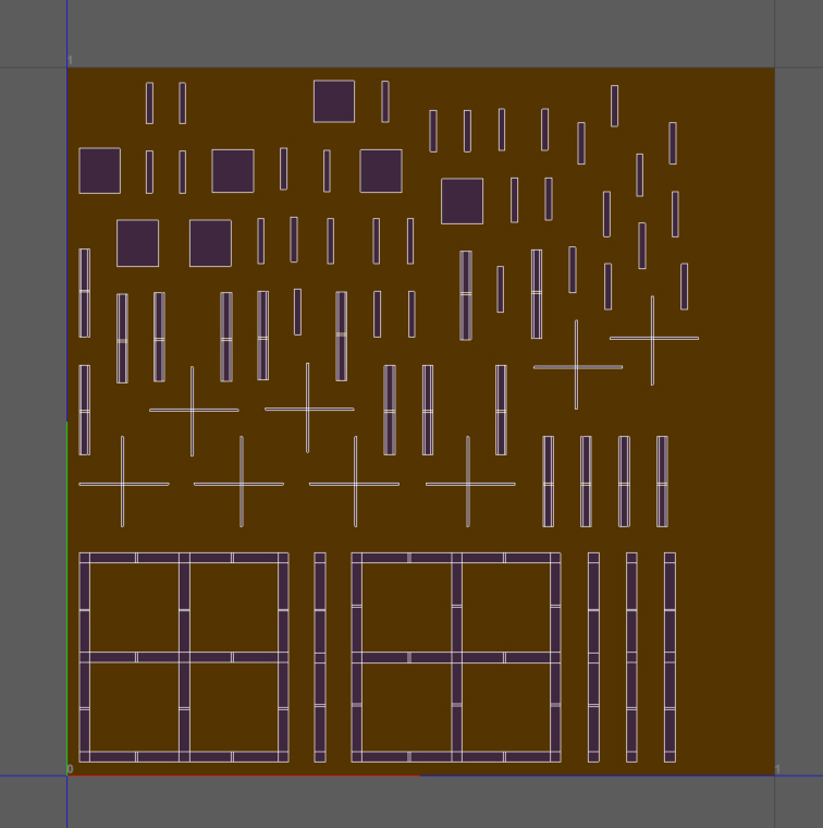
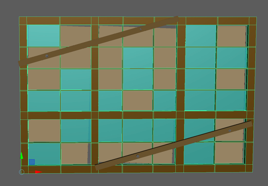
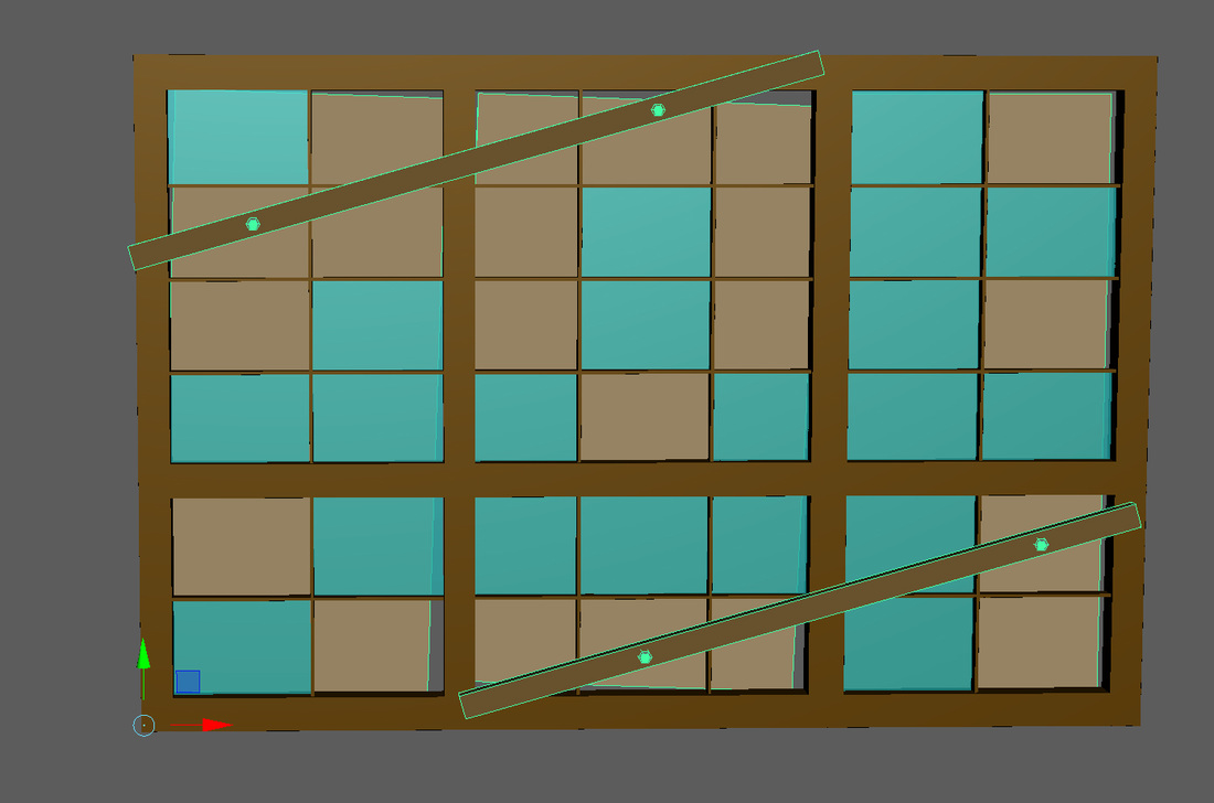
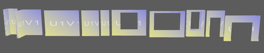
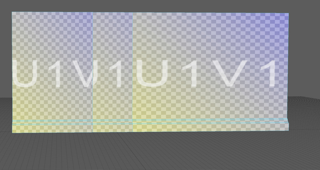
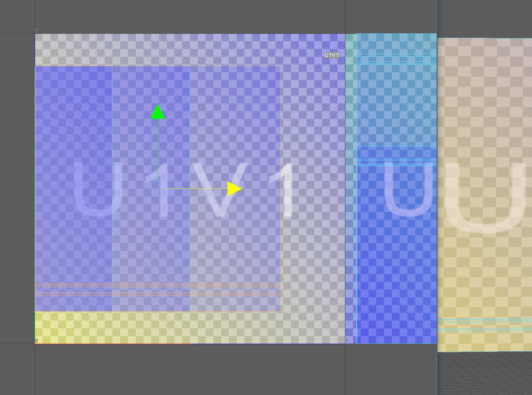
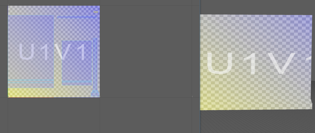
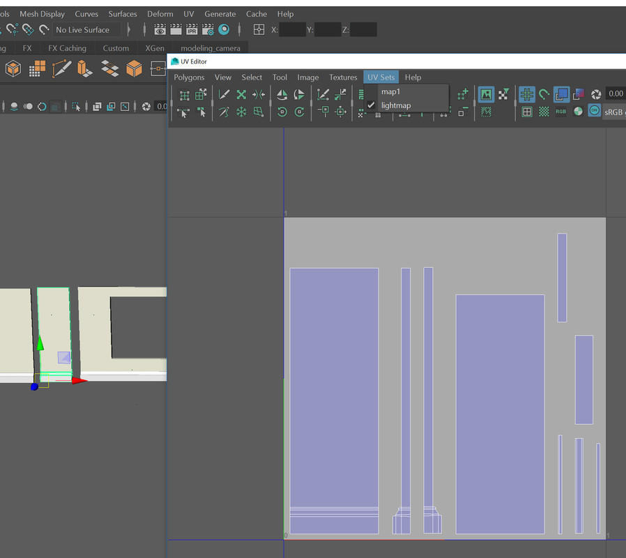
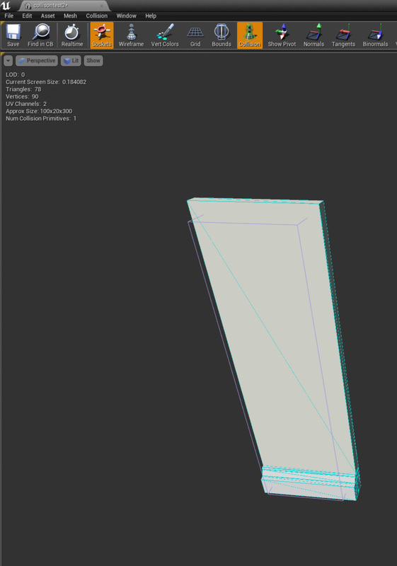
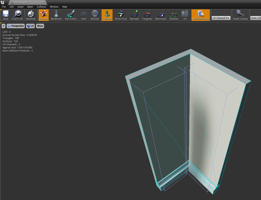
Before I can texture my assets or create light maps I need to create UV maps for my meals. UV mapping is the 3D modelling process of placing a 2D texture onto the surface of a 3D model. As the XYZ axis are already used in the 3D space, we have to use U and V for the axis in the 2D space. So when these two are applied together U and V axis of the 2D texture it projects its coordinates onto the 3D models axis of XYZ. We can't texture onto a 3D model so we have to unwrap each side of the model so that it is flat, but still shares the same UV grid as when projected it will need the coordinates of this UV grid as it shares the same location with the vertex of the 3D model. How I created these UV for my models I selected the model I wanted went to the UV editor and I have the basic UV that Maya had made for me 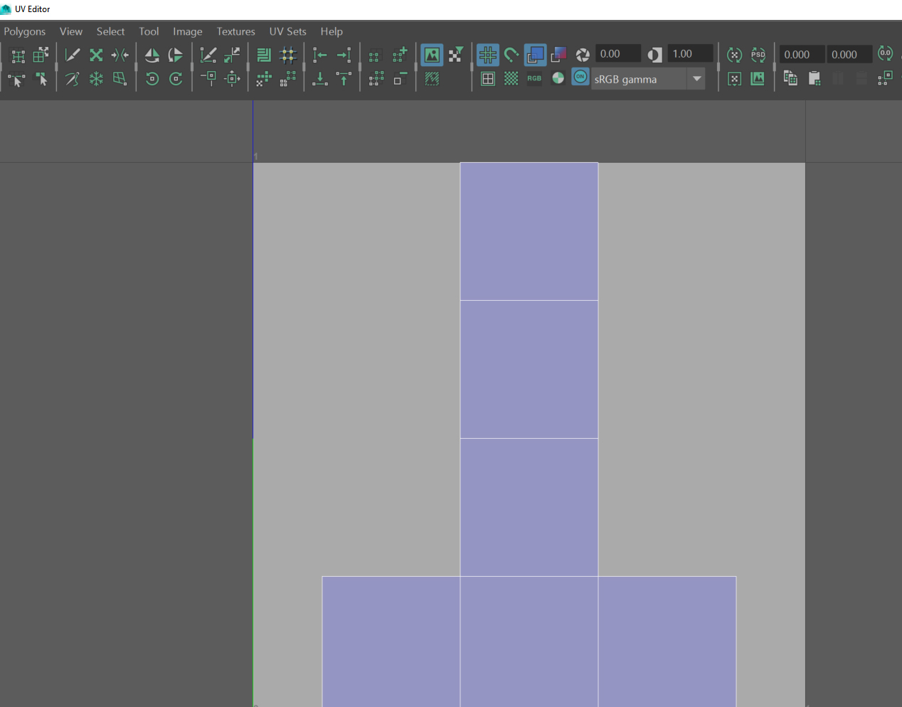 from here I have two options I can press, automatic UV which will do its best and work out my UV for me and the space they need and all I will have to do is rearrange the UV and scale them or I can select each shell and planar it, this works better if I want multiple shells connect together as shown in the photo below. 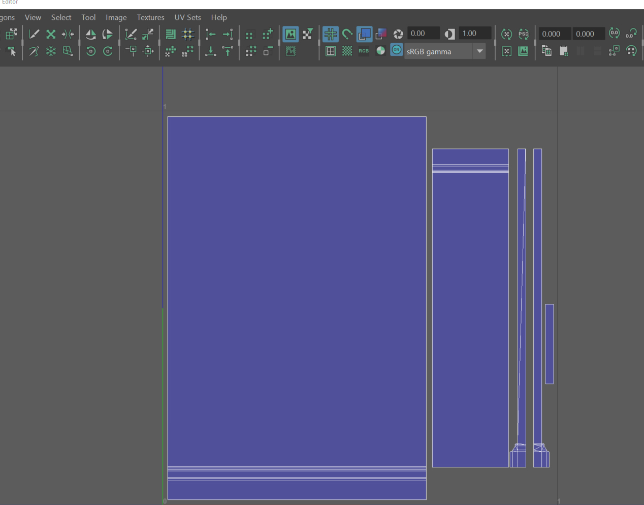 After I created the UV for my models I then use the 'display chequered tiles' to place a chequered overlay on my 3d models this is where I do the final scaling of my shells and make sure they are lined up the grid and the squares are square as possible. *note: Smaller the squares higher the texture resolution will be* 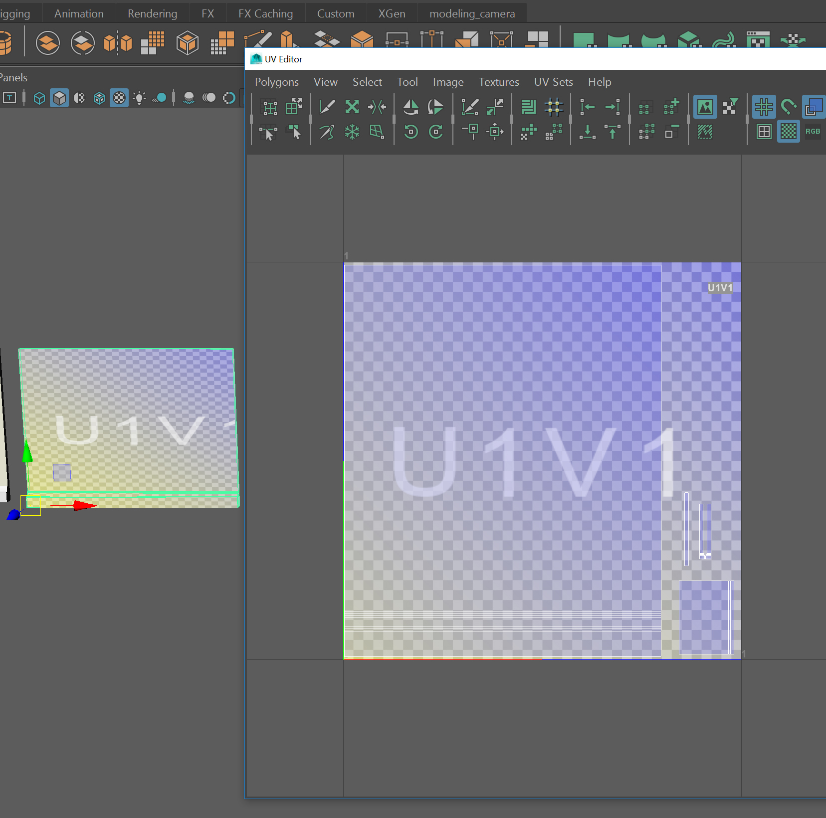 As I am making a modular pack I want my walls, windows, doors, etc to snap to the grid and fit against each other flaws. But I also want some of my modular pack to be non modular but snaps to certain modular piece e.g boarded up windows. I did this having my grid to 10 units so it would match unreal engine grid, then by moving the pivot orientation of the mesh to one of the bottom corners and snapping to the vertex there. Then I would make sure the it was centred to the world by giving the pivot the coordinate of 0,0,0 on the XYZ axis. For the non modular assets I snapped it to the grid and positioned it to where I wanted it against the modular asset and placed its pivot to the coordinates of the modular piece coordinates which would of been 0,0,0. Exported both to unreal and to test if the pivots snap to the same place. I wanted to create custom collision boxes for most of my modular pack, which has it's advantages over using the built in function of unreal engine auto-generated collisions. Collisions are important for games as it stops the player falling though the meshes or bullets from the guns going thought them as well. It also helps with the physics of the game too, if to meshes collide in the game without collision boxes they will fly though each other, with collision boxes they would collide and bounce back or stop for example. Another advantage of using custom collision boxes I can chose the size of the box so it can be thicker so that the player gun for example wont go though the wall. I created these collision boxes inside Maya by using a cube over my asset and renaming the cube with the same name as my asset, but starting with the prefix of UBX_ and ending in _00 and for multiple boxes I increased the number e.g. _01, _02. I could also of use USP_ if I used a sphere if my mesh was more round, and I could of use UCX_ which is a convex shape if a cube wouldn't work but wanted to move the vertex so it was more of a parallelogram shape. Then I exported it to unreal and tested the asset to see if could walk thought it. For each assets I wanted to create normal maps so that my assets appear to have higher geometry than it actually does, helping performance. Normal maps, add extra detail that is fake geometry, it creates an illusion of depth. It does this by using RGB information not like bump or height maps that use grey scale information. Using the RGB information it corresponds which the XYZ coordinates inside 3D software like Maya or unreal. it uses this information to tell the 3D software which direction the normals are oriented to give the meshes shape and depth. How I created my normals for my modular pack was inside substance painter, I made a diffuse texture map and I baked a normal map of this creating extra geometry and depth. I did this by baking my model beforehand by clicking on 'bake textures' in the texture set settings, and increasing the output settings and baking for all the materials. Then I was able to add depth with alpha brushes 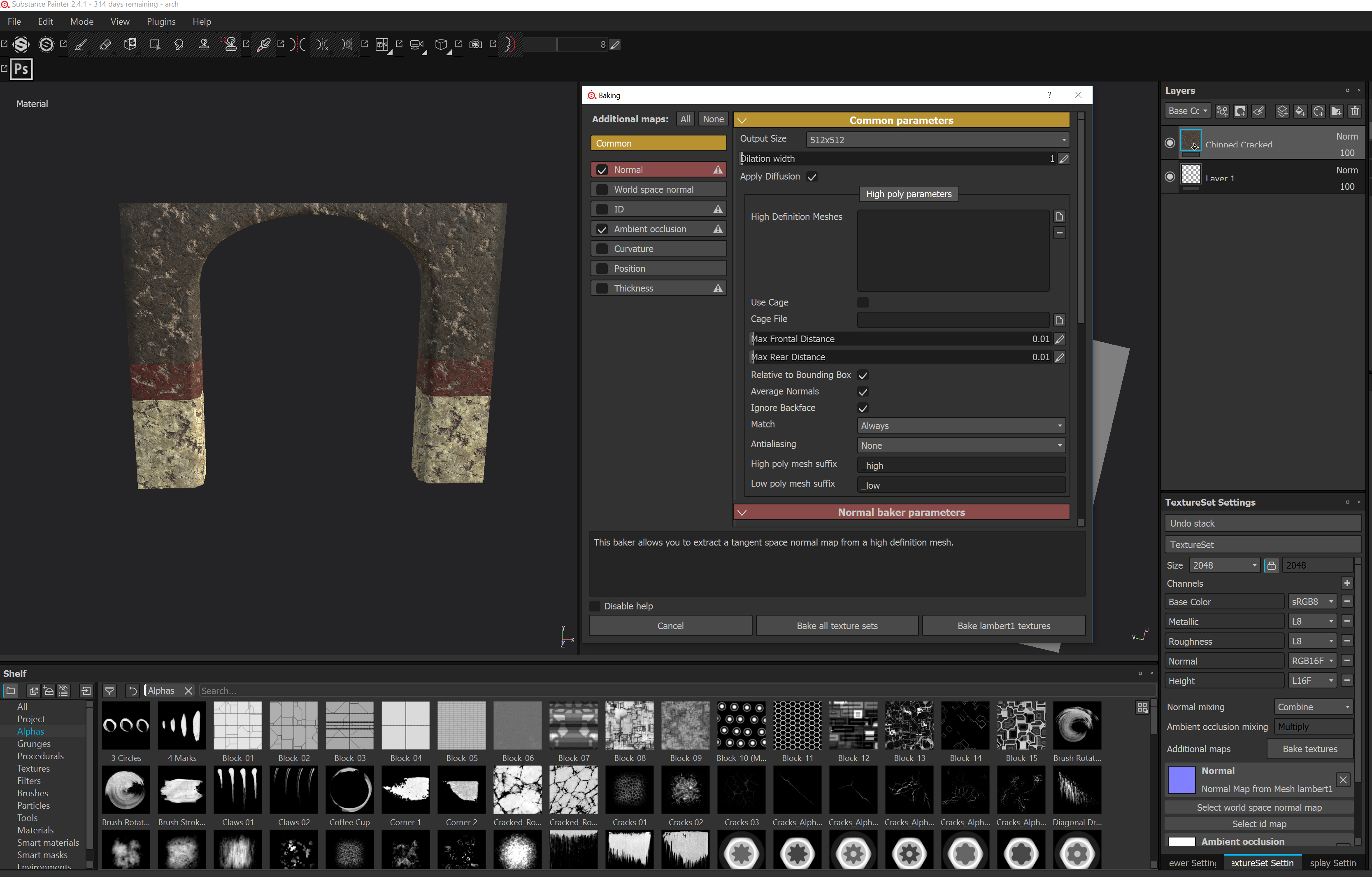 Once I created my normal maps I went back into Maya and applied my diffuse map and normal map to the lambert texture via hyper-shade I did this to check for any errors of the texture not fitting onto the mesh correctly and did a quick render of it. I had to create light maps for each of my assets, light maps are very important maps for the assets inside of unreal engine as they store all the light formation for an asset. The light maps have there their own UV space and need a certain amount of space between the shells. once the light maps have been baked they look better and have minimal impact on performance than dynamic lights which don't require light maps. how I made the light maps was I created a copy of the UV of that asset into a new UV space 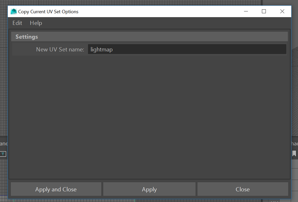 selected the new light map 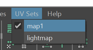 I wanted the space between the shells to be more than it was, so I selected all the shells when to layout and changed the space to 2% and pressed layout. This rearranged the shells so there was 2% between shells. 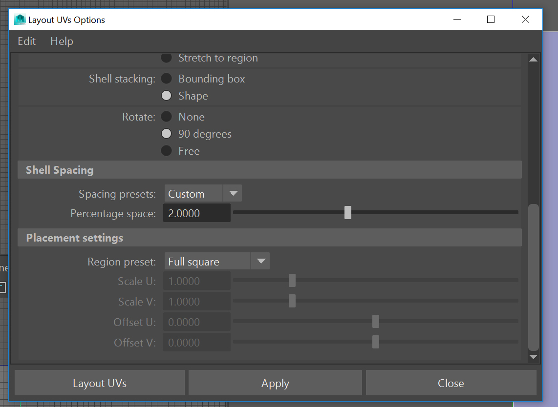 How my light mapped looked after the 2% layout spacing. 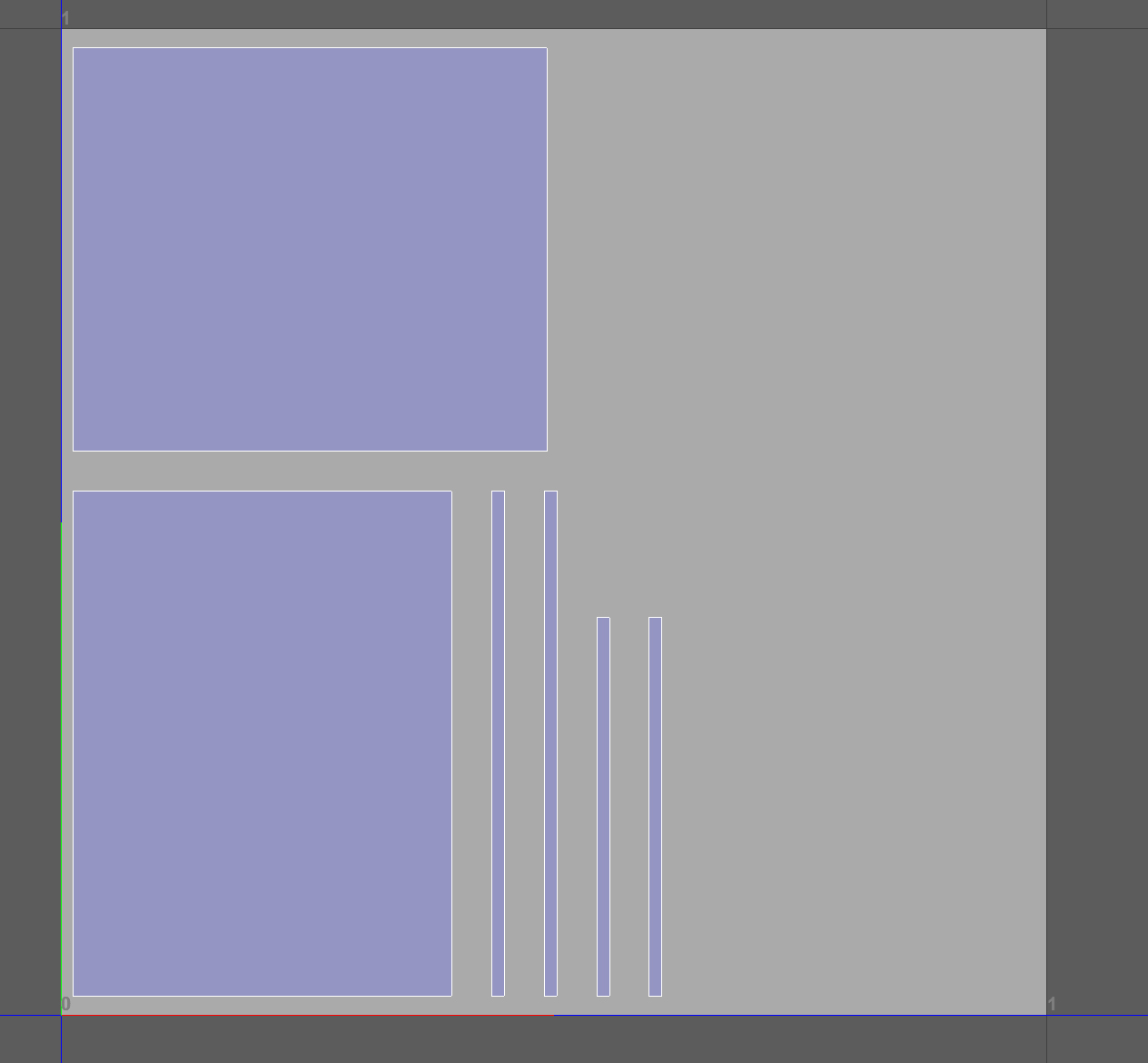 After this I took it into unreal and complied the mesh and see if it had any issues regarding overlapping. If unreal came back with any light map overlapping I would have to increase the shell spacing percentage  When I was making my materials in unreal, just placing the texture maps (diffuse, normal, metallic, roughness and AO) I had to use nodes to either make my material tillable or to adjust the normal map depth. 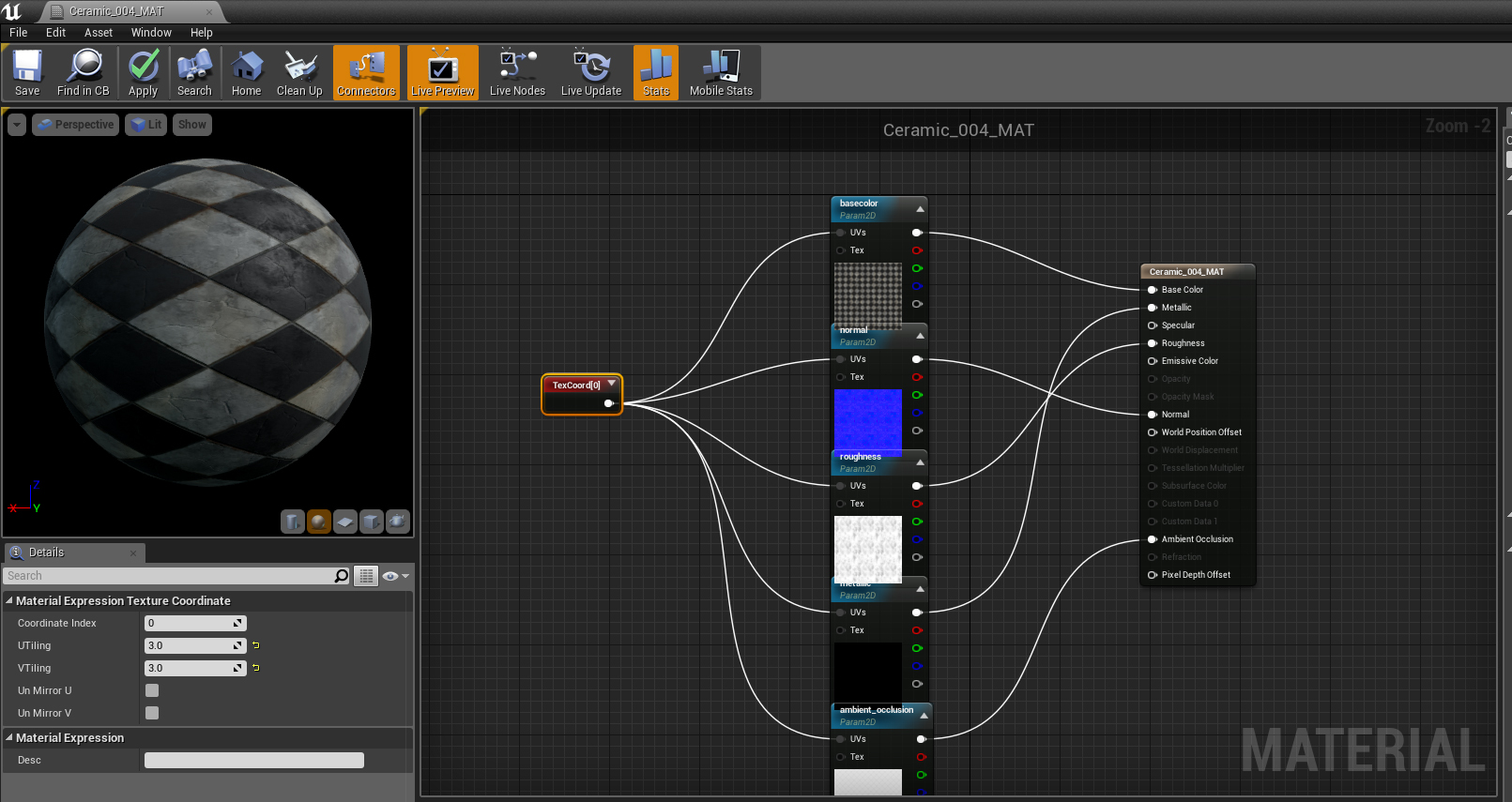 In the photo above, I had to add a 'texture coordinate' node which outputs the UV coordinates into two channels, allowing materials to use different UV channels so this makes the UV tillable, stretched or compressed. 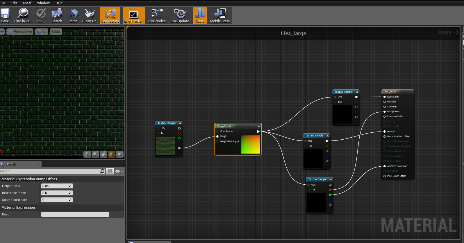 in the photo above, I wanted to make the depth in material deeper so I added a 'bump offset' node (also known as parallax mapping) which gives the illusion of depth without extra geometry. It uses a greyscale height map with a higher brightness value gives more depth. 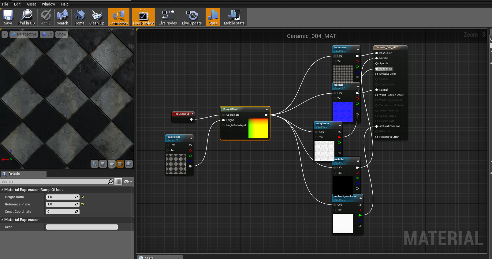 I decided my tillable texture needs more depth to it so I added a 'bump offset' node and then connect a 'texture coordinate' to keep it tillable.
In this blog post I am going to evaluate my modular pack, I am going to break it down into three sections which are: What went well, What didn't go well and issues/changes along the way.
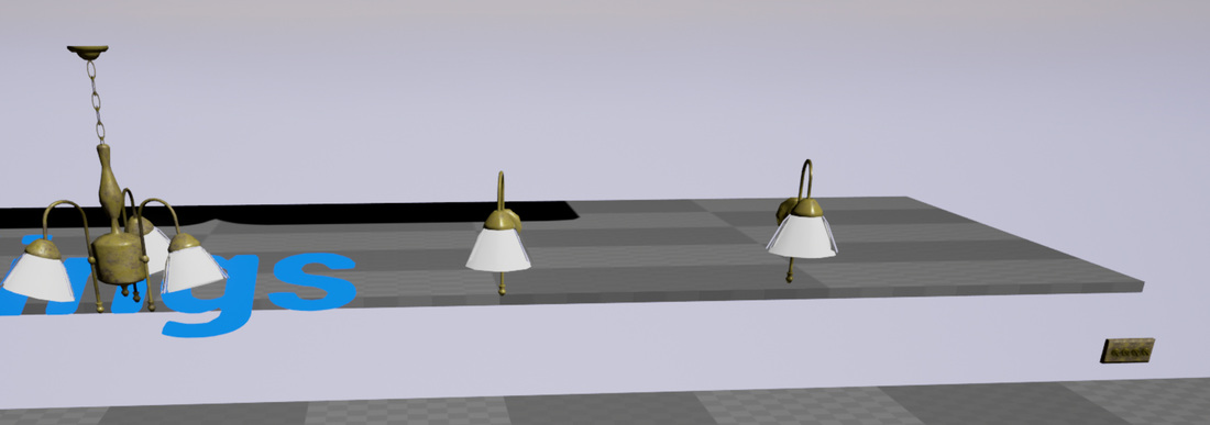
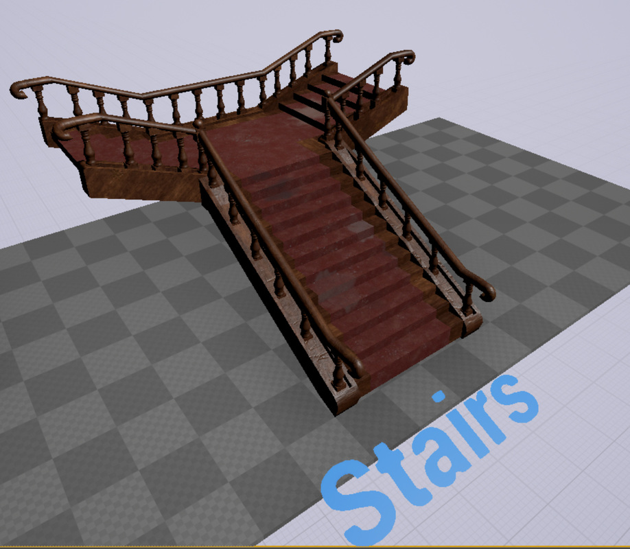
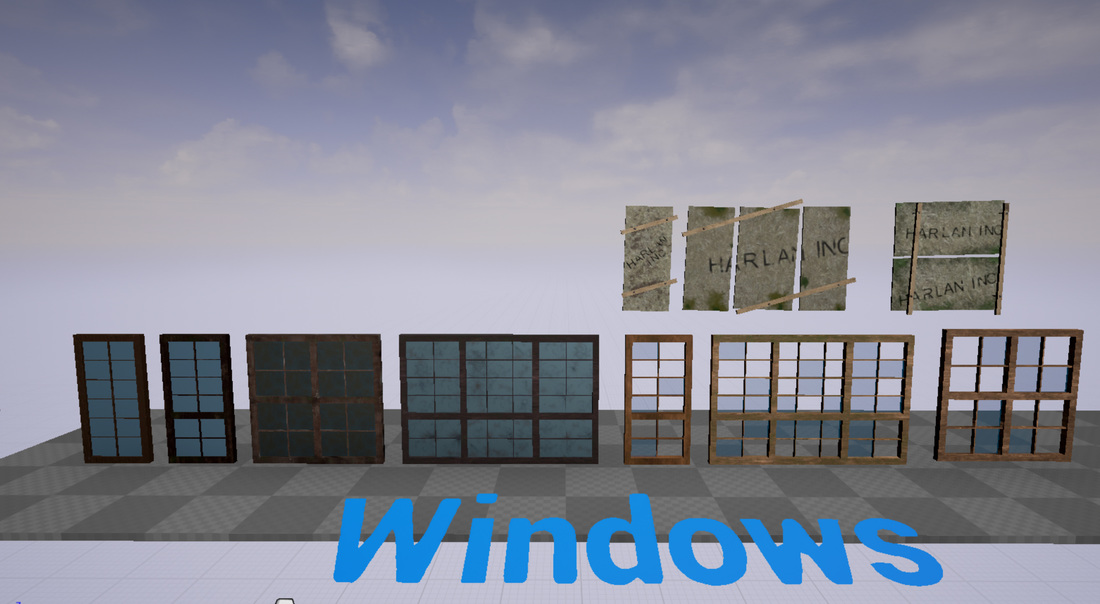
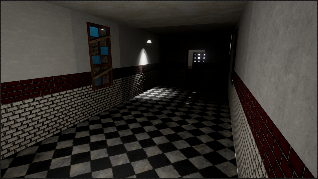
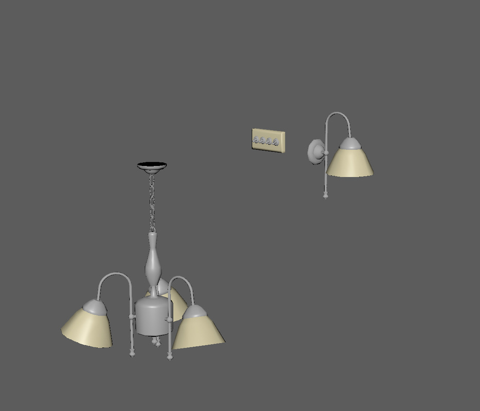
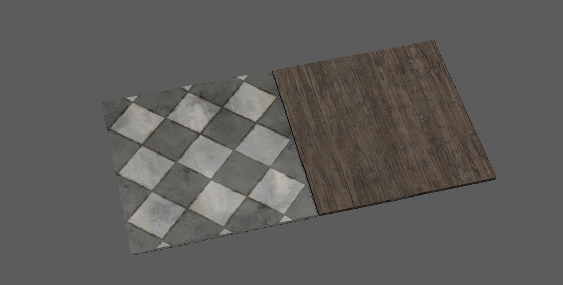
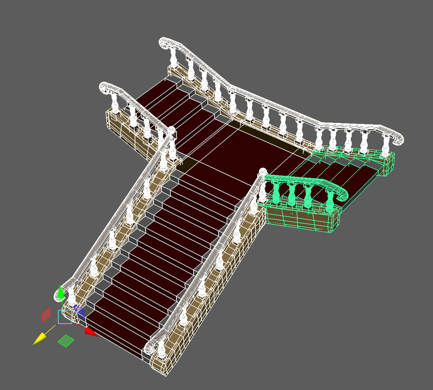
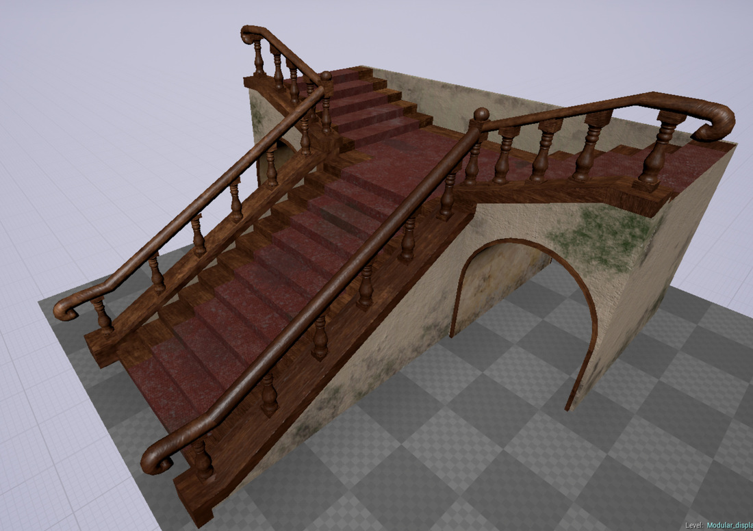
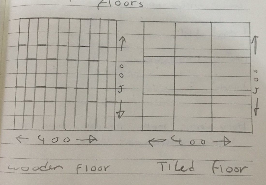
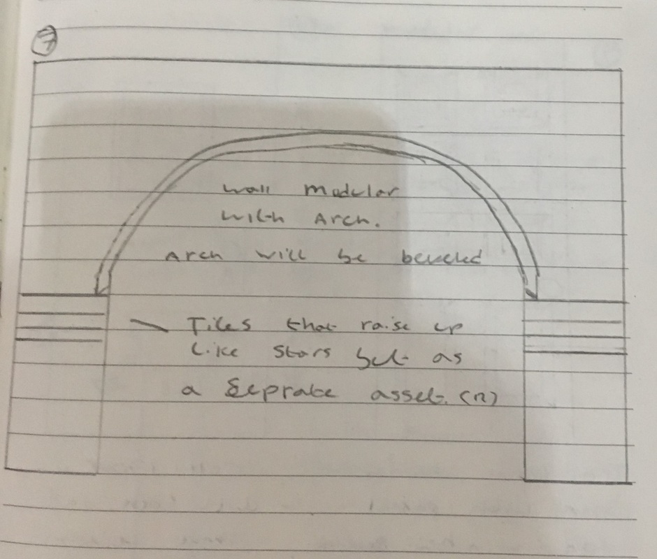
What went well in Unit 9 Task1: Task one went extremely well for me, I had an idea of doing a horror survival in an asylum and I knew there was a banded asylum not far from me so this helped me with inspiration of how to conceptualize my ideas, blueprints and creating basic 3D models of my concepts. It also gave me an insight of how urban explorers feel when going to these places and how airy and creepy the atmosphere is. Task2: advancing my basic models in Maya went well, I made sure all the models I made had UV's and light maps, over half of them I gave custom collision boxes and they all had diffuse maps and normals applied to them in unreal with some tested in Maya. Adding all the texture maps made me look into advanced techniques and different types of texture maps like ambient occlusion and emissive light maps which kept me pushing to try new things inside Maya which I have not done before. Task3: task 3 was a quick process as I had all my models ready and textured and just needed to present my models in an overview and into categories which was quite quick and then finally making a small demo level of what could be done with the modular pack to show it works and how to use it. I got minimal errors when compiled in unreal, which were easy fixes like overlapping light maps. Conclusion: Overall, I think the modular pack went extremely well, I ended up having 69 assets for my modular pack which was over triple the mount required in the criteria and I possible could of had more if I had a little more time. I am extremely pleased with how both my stair cases turned out after modelling and texturing. Even though building this staircase gave me many headaches of how to problem solve UVing for such a big asset which resulted in breaking down the stairs into pieces that would connect back together in the engine, this gave me more UV space and a better texture quality overall. I applied collision boxes to over half my assets and making sure they were numbered correctly and an enough space left between each collision box I didn't run into any problems with these. The light maps also went extremely well, out of the 69 models I created, when I ran the build feature in unreal engine I only got two light map issues which both were under 2% and was easily fixed What didn't go so well in unit 9 Task1: Even now I thought task 1 went well, I spent a lot of time trying to block out a level in unreal engine of the layout I wanted for my asylum. Looking back on this now I feel it was a waste of valuable time that I could of spent making the modular pack asset better. Task2: I found the technical side of the task a little challenging even though I know how to apply the techniques I learned to my 3D models. I found trying to write, why I need to do this and how it works quite challenging. In the end, I did more research on the areas I struggled to write about and broke it down so I found it easier to understand. Task3: setting up materials and applying to the 3D models was a little time consuming other than that there wasnt any serious issues to sort out just minor geomatry fixes and texture fixes when i had a closer look at my models in unreal. Conclusion: The final end product for some of the windows and the medical door. The glass in the windows of the smaller ones came out dark, repetitive due to UV overlapping, and not unique glass planes. In my original brainstorm I wanted each window plane to be broken/dirty or have its own unique appearance. As I wanted to save on UV space to have a better texture resolution I overlapped the window plane UV which resulted in the planes having the same texture, the solution I came up with was just to use a very strong transparent glass material in unreal engine that didn't have any cracks or dirt on. For the medical door the model was how I wanted the door to look like, but once I textured it, it didn't look like what I had hoped it to look like, I wanted it to be a metal door that after years of neglect the paint was flaking off. Instead, it looks like the door had clouds painted onto it and gives the wrong appearance for what I am trying to achieve for my modular pack. Issues and changes I had along the way in unit 9 The wall gave me a numerous issue along the way which I problem solved and changed. The biggest change I did on my walls was in my brainstorms I had fully tiled walls and half walls, which were half tiled and plastered and planned on the player being able to knock off the tiles from the wall. When it came to modelling these walls, getting the measurements exactly the same, so each wall would interlock and be no seam, making sure every other row started/finished on a half tile so each row was offset different. In the modelling process each wall ended up high poly, the walls had to many N-gons, and to fix this would of pushed the poly count up higher. My solution was to scrap all these walls and build fresh models that were low poly, take them into substance painter and apply a texture that did the same effect as my original models and increase the height/normal maps on the tiles so it gave the illusion they had more depth to them. Not only does it improve performance for the user it also look more visually better and less problematic. Although this did create it own problem, if they UV didn't line up with each other the textures would appear out of align on the seams and ruined the effect. I had to spend some time aligning the UV up on each wall with the grid display on and made sure each wall started in the same place. effect. I had to spend some time aligning the UV up on each wall with the grid display on and made sure each wall started in the same place. I also had to use this technique with the floors and ceilings so that there wasn't a seam had the floors ran as a conscious patten. Other issues I had was when importing models into unreal engine I would get the following error 'object has degenerated tangent bases' which would make me go back to the model and look for any problems on the mesh. using 'cleanup' in Maya helped me find some of the errors, a usually random vertex that I forget to delete or hidden faces from a bad extrude. Most of the time cleanup didn't find any errors and it was basically down to overlapping UV or missing out a face when UVing and was easily fixed. I created a wall light, a hanging light and some light switches in Maya, UV and created light maps for them. I took them into substance and gave them a brass material and made it look old and dirty. I then imported the lights into unreal and applied the textures. For the bulbs I created an emissive texture that makes the texture that makes it own source of light, and is more efficient that using the lights. Once I applied these materials I created a blueprint and place my wall light inside of it with a point light and I applied a light function to both using a black and white JPG to make the light turn on and off as if it was flickering. I made a simple arch inside of Maya, put the pivot on the bottom corner and move the window arch axis to the same position as I wanted this to snap into the same place in unreal engine. I made UV, I overlapped the main arch as I know both sides of the archway are going to be the same, so I saved more UV space and will get a better texture resolution. After I created the UV's and lightmap I wanted to do a high to low poly bake onto my arch what I did was take my mesh into substance painter, baked a blank normal map onto the mesh and applied a concrete material and used an alpha brush with minus height on it to create cracks and broken off the concrete. If I did this in mean I would have to have a very high poly mesh, but using a texture I can keep my poly count down and have a mesh that looks like it was high poly.  After making my textures in unreal, I took them back to Maya and applied them to the lambert textures via hyper-shade and did a quick render to see if my normal maps were working. Then I imported it all into unreal and applied the textures to the materials along with ambient occlusion maps  For the floors and ceilings I started off with just a basic square 400 by 400 and 10 height, and imported the texture I wanted to use inside of unreal. I did this so I can get the UV scaling right as I want to make these tileable and don't want that much of a seam. I adjusted the UV so that they would snap to the grid.
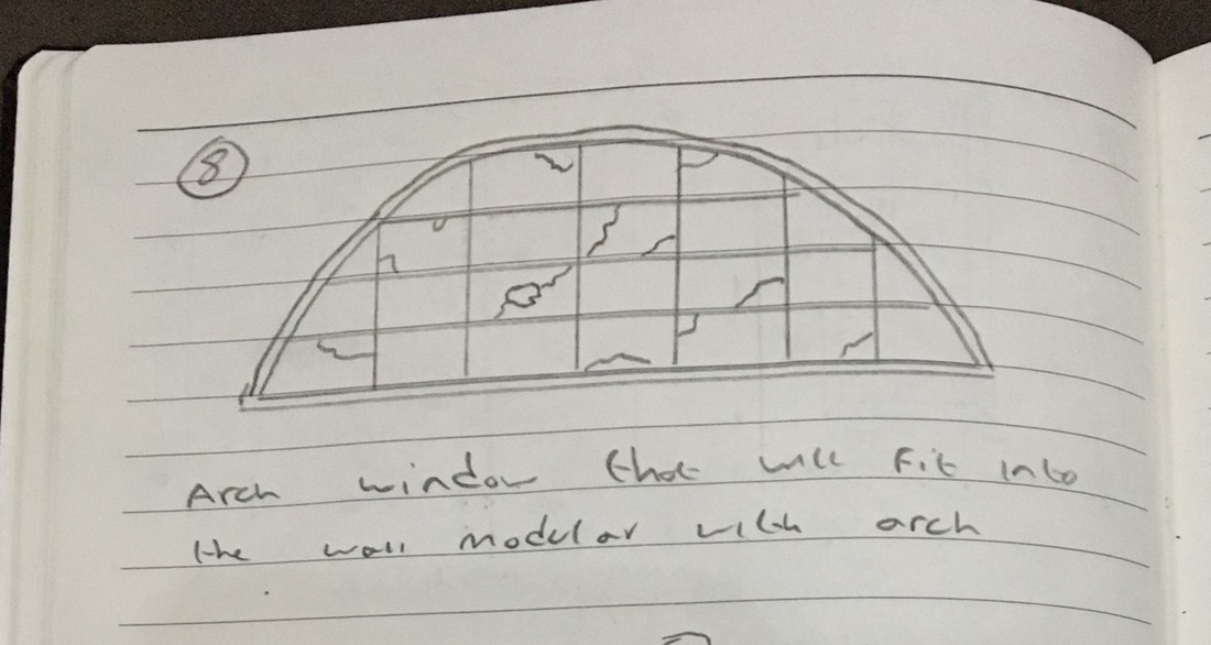
Once I did this I created a new UV map and called this lightmap and used the 'layout' function to give them 2% space between shells. I imported the meshes into unreal created the materials for them and tired out the materials to see if there was a seam or they didn't line up, the tile floor texture took a while to line up and had to apply a 'texture coordinate' to the UV in unreal to make them scale properly. While in unreal, I also added a 'square collision box' around the meshes. for the windows i made sure each window was UV, i tried to be more efficient with the UV space by overlapping the window planes and the wood framing as the backside of the window would be the same as the front. As well as the UV i created an extra UV map and called this the lightmap and made sure i used the layout in the UV editor to have 2% space between each shell. I also made a simple cube collision box for each of the windows, I didn't make a collision box for the plywood that would go behind the broken windows as the window collision box would stop the player reaching these. I named the collision box the same as my window names and making sure it started with the prefix UBX_ and ended _01 for the pivots I placed them in the bottom left corner and for the plywood that goes behind the window I made non modular and shared the same pivot as the broken window so it would snap right into place when placed into unreal engine once I imported the windows into unreal engine I first checked to see if they fit flush into my window modular walls, which they did and I got my scale right for the windows and walls. After that I took each model into Substance painter and give it own unique look, made a glass texture in unreal with adjustable transparently so I can adjust how much outside light can come thought the window planes.
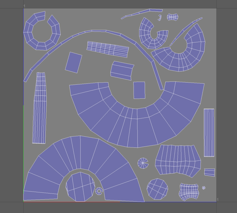
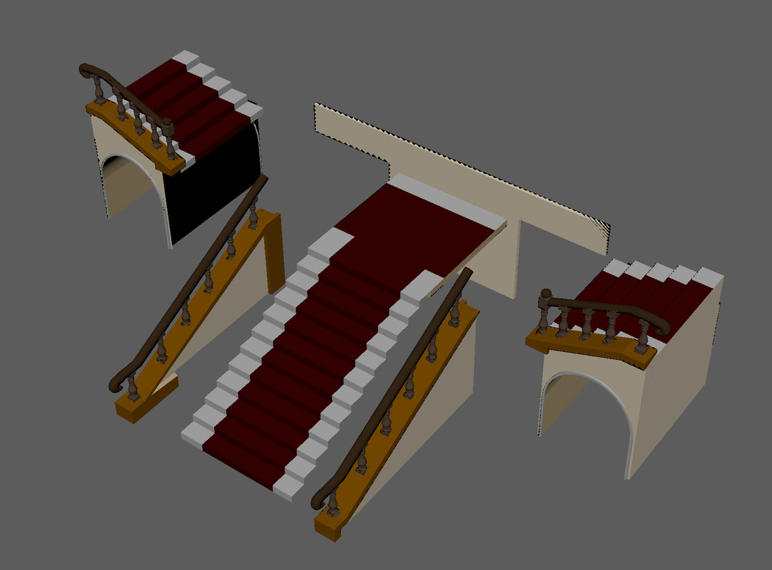
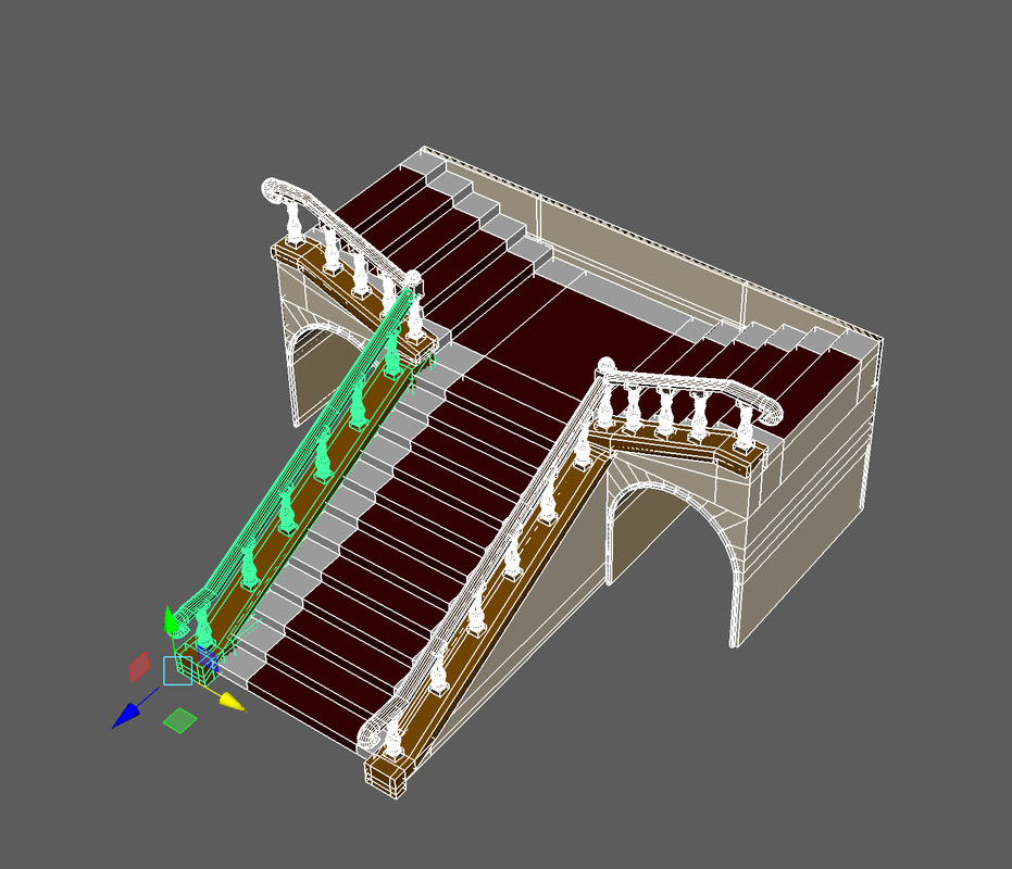
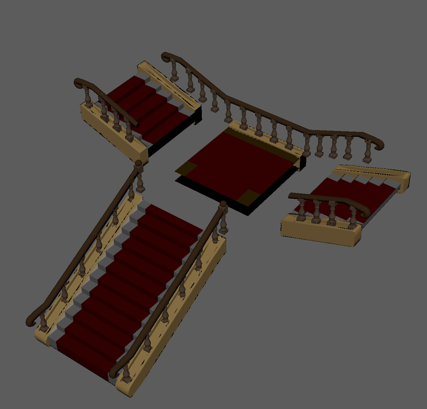
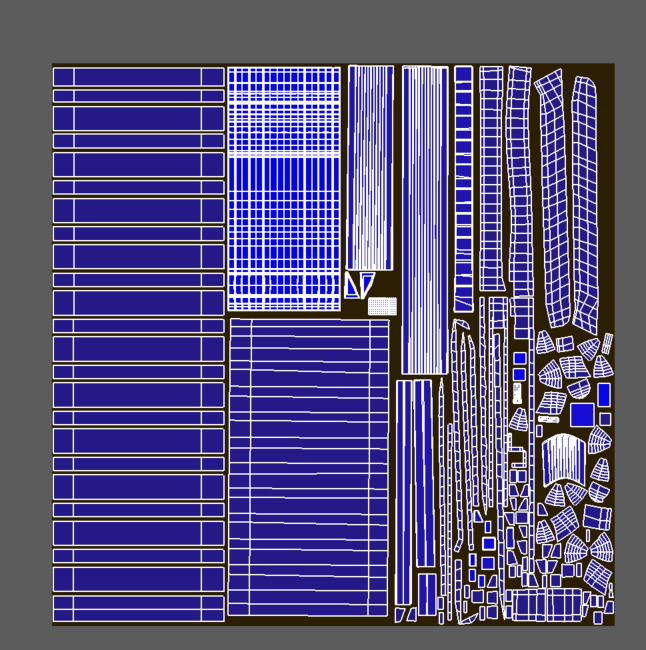
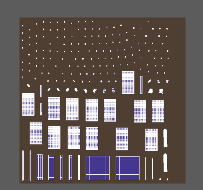
I choose different texture sizes from 4k to 1024 depending on the size and how viable it was to the player, so the frame and window planes, plywood are 4k and the bar of wood on the plywood and the smaller windows are 2k while the bolts and less visible parts are 1024. For the stairs as they were big models i had to break down each stair case into 4/5 sections so that i could have enough uv space for a good texture resoulation I was going to create an convex collision box but i decied in the end to let unreal engine make the collision box for me as i came to the conculsion there would be far to many customer convex box and more room error For the UV I decided to overlap a lot of the sale to make more space on the texture sheet, for example the balustrades are identical model repeatedly used on the stairs so I place all the shells on top of one another. Which gave me more space and potential better texture resolution. Then I copied the UV into another UV map and used the layout to create a 2% space between the shells for the lightmap once I completed the models I took them into substance painter and gave each staircase, its own unique look, exporting the textures to unreal as the TGA format for the alpha channels. I made sure the less visible textures were 512 and 1024 while everything else is 4k resolution.
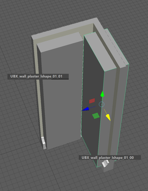
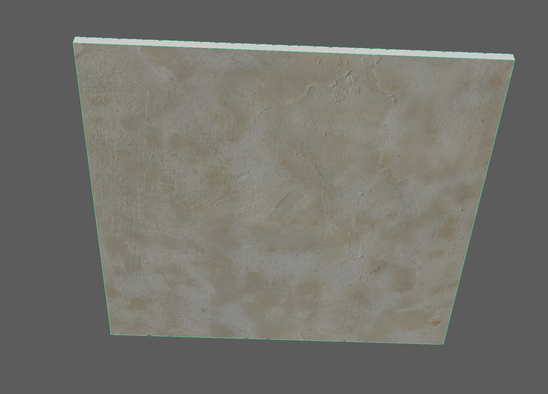
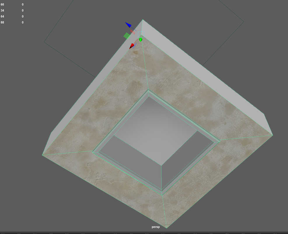
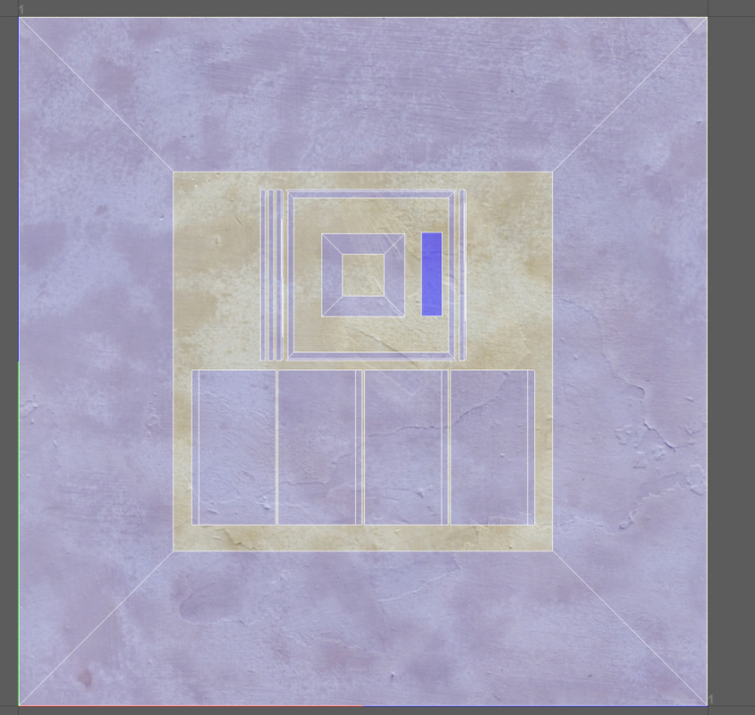
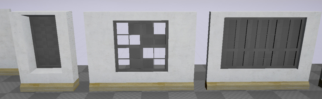
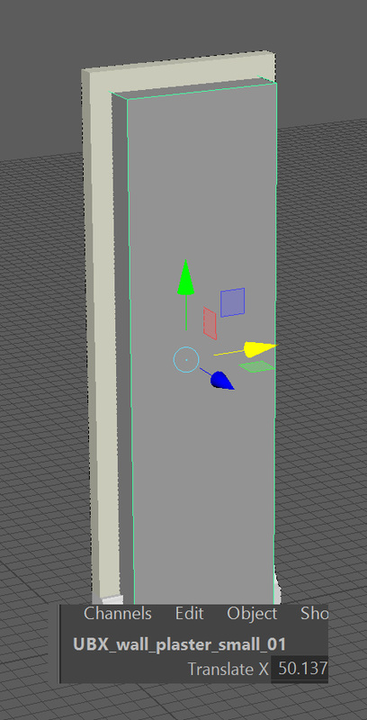
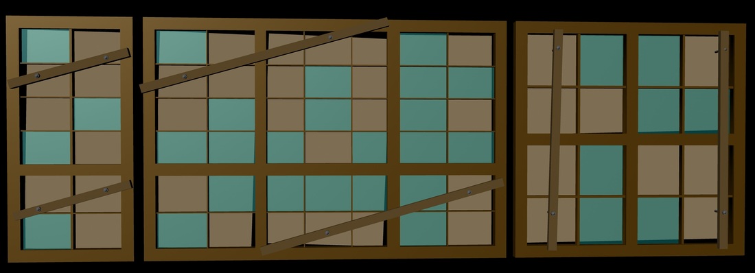
After I created the basic mesh for my walls, I needed to snap it to the grid and move the pivot, make UV and lightmaps for the models, create coalitions and place a tolerable texture on the models. What I did first created UV maps for the wall models, as shown below in the photos For the basic wall I need to line up all the UV for each wall so they are the same height and snapped to the same part of the UV grid to minimize seams appearing in the textures when in game. I did this by lining all my walls up together and lined them up by using the UV grid and making sure the squares are the same size and in right patten. Then I moved the UV shells so they are on the same part of the UV texture grid. I place the remaining wall parts that would not be seen by the player in the remaining space and scaled down in size, as shown in the photos above. for the windows I decided to overlap the top and bottom and the left and right sides of the inside part of the window as I plan that these will have the same texture and to optimize the UV space so that there would be more detail in the textures once the textures are applied in unreal using a simple base material and 'texture coordinate' node the walls are close to no seams, they are very slightly visible to completely get rid of these I would have to apply a texture on top of the UV in photoshop or in substance. For the lightmap I copied the UV into a new UV map and called it lightmap, then I went to layout and changed the space options to 2% and pressed the layout button to space the lightmap UV out to prevent shadow bleeds, when the UV in the lightmaps is to close and clash with each other and cause a shadow bleed After I created the lightmaps I placed each wall into its own layer in maya and place the pivot on the bottom left hand corner and zeroed out the axis so that they were at 0,0,0. After I did I created a simple square collision box for each of the walls and named the collision box with UBX_ (model name) _01 so unreal engine would know that it is a collision box and for what model. For the L-shape wall, windows and doors I needed multiple collision boxes, I did this by the same principal of using UBX_ (model name) _01 but after adding _00, _01 etc. (UBX_ (model name) _01_00) for each box and unreal will place those collision boxes with the right model in the correct order. After I made them in Maya I did a quick export to unreal to see if the box where working and unreal recognised and made a collision box from the mesh I made in Maya. Once all the maps and collisions were done in Maya I exported all the walls to unreal and applied to materials from substance as a base mesh, the wall texture I used is seamless and only shows a slight seam when the walls are together. I will be replacing the textures with a custom seamless texture in the near future. I made sure the textures could be titled by adding a 'texture coordinate' node to UVs inside the material editor
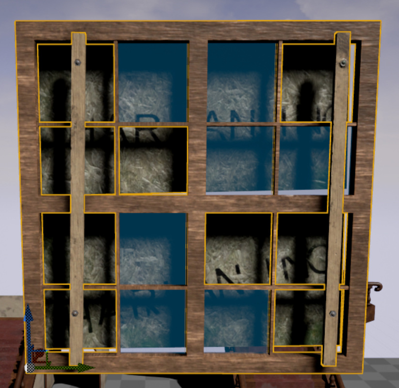
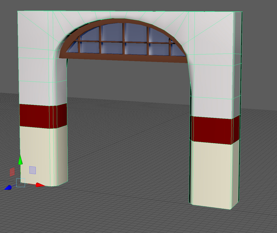
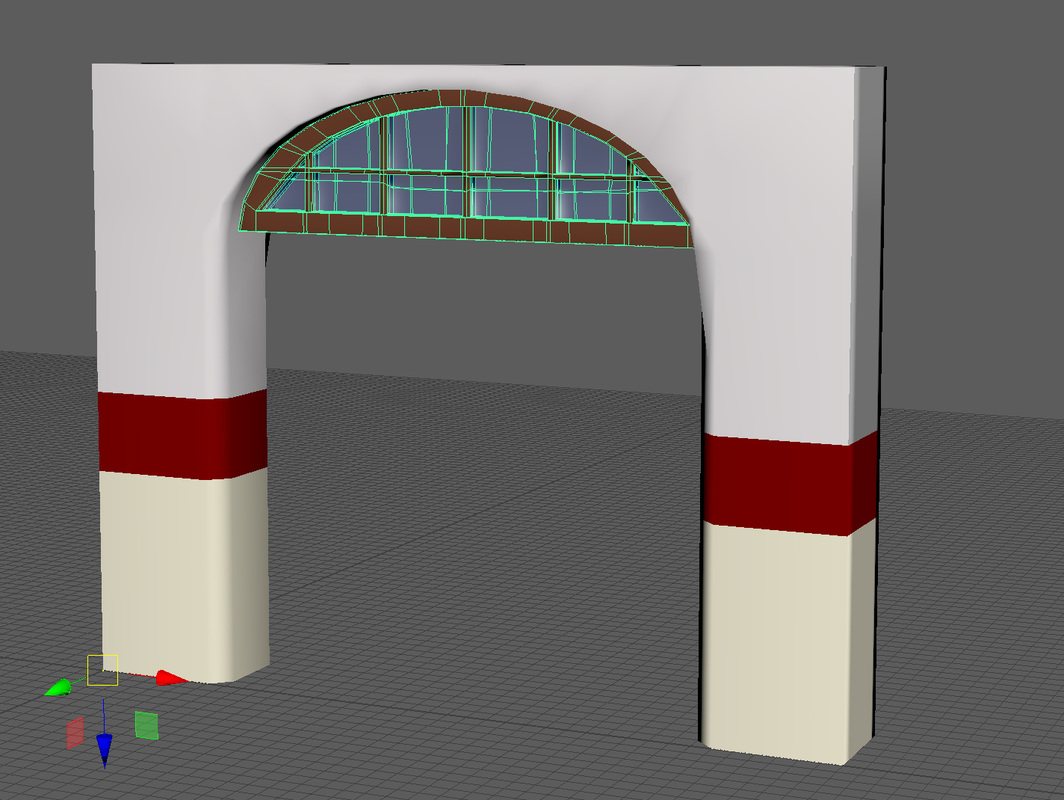
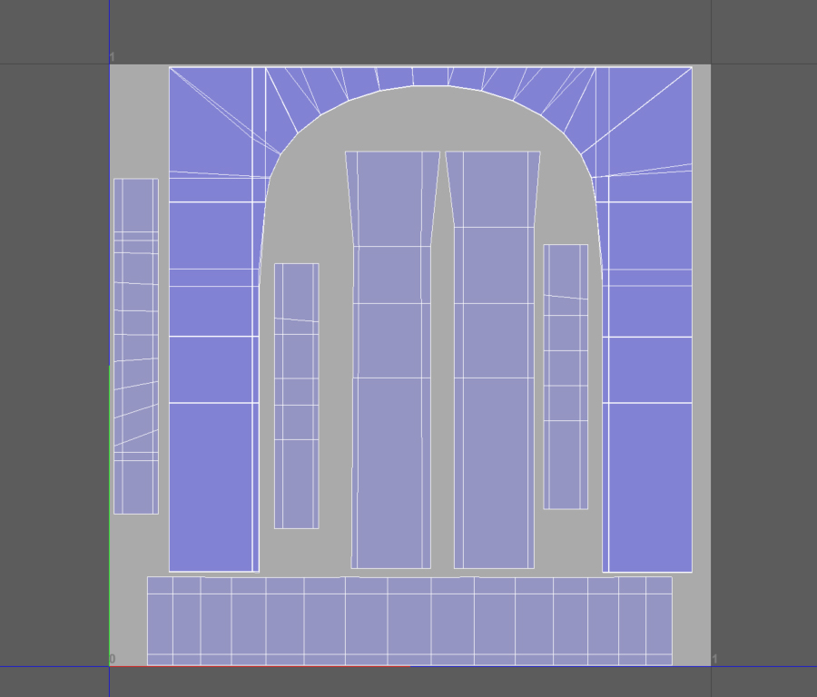
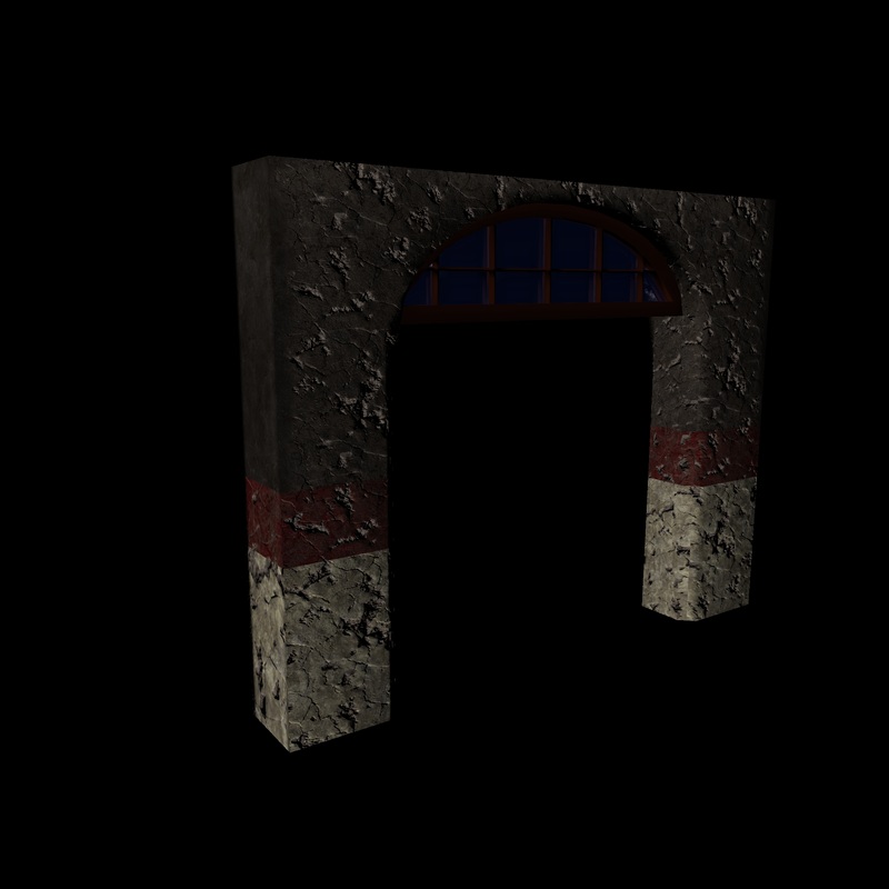
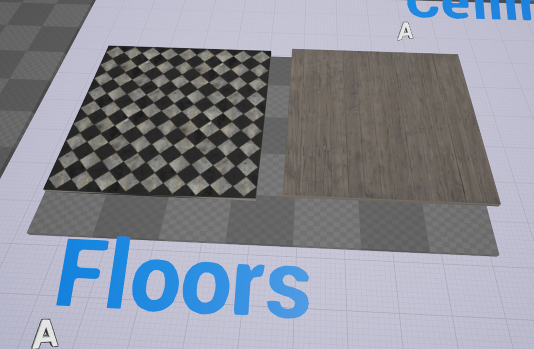
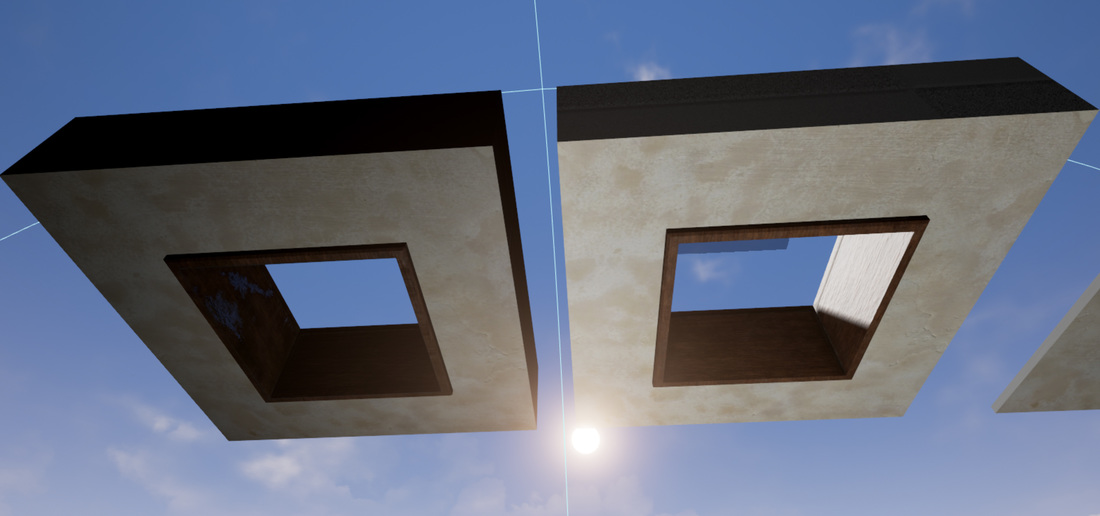
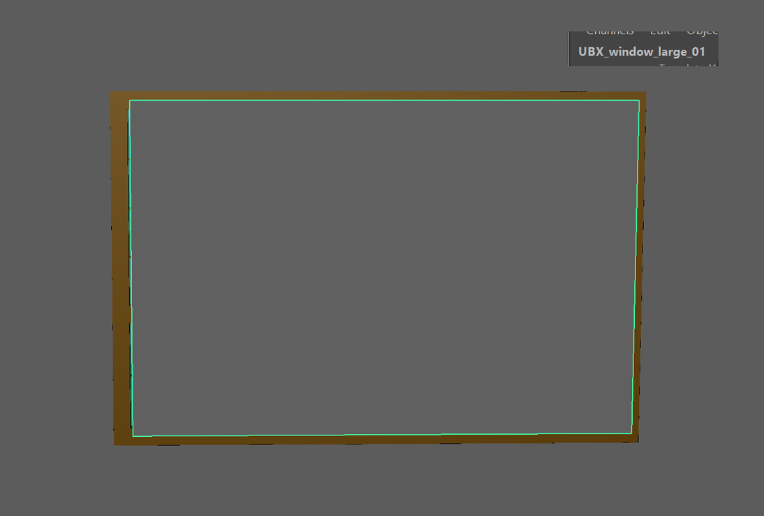
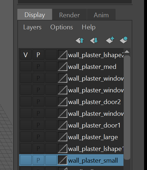
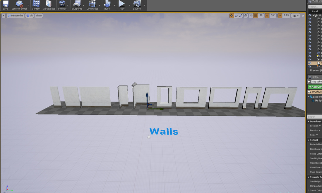
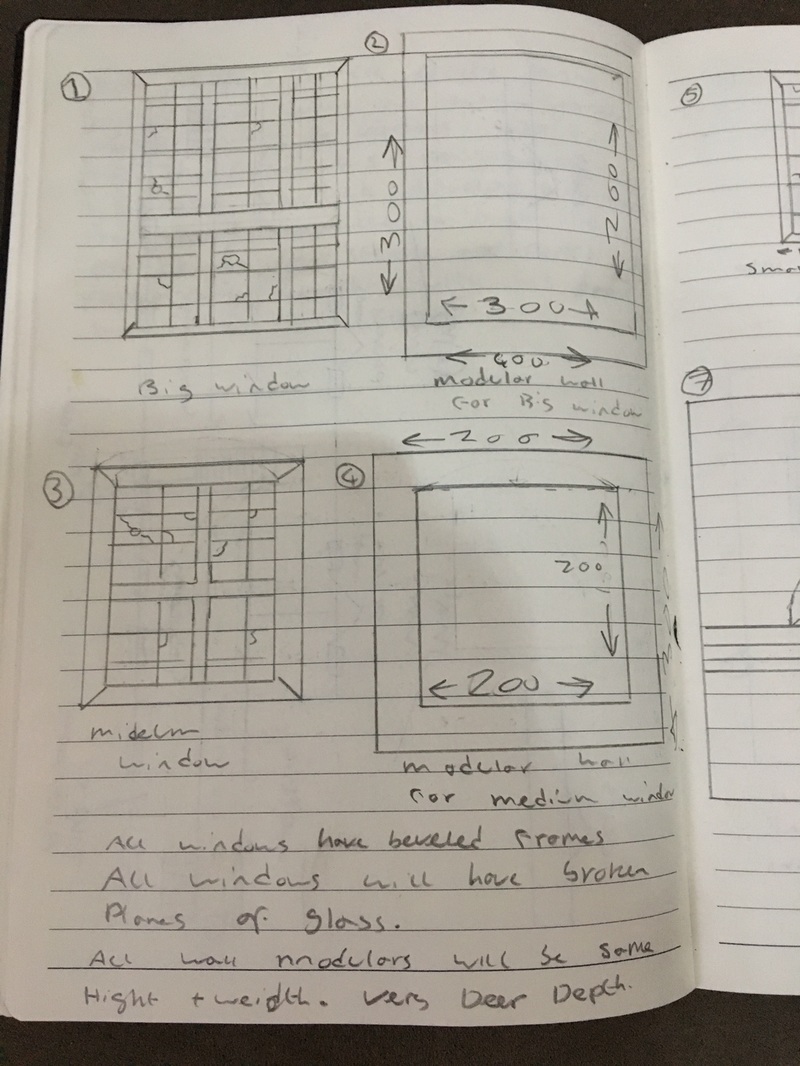
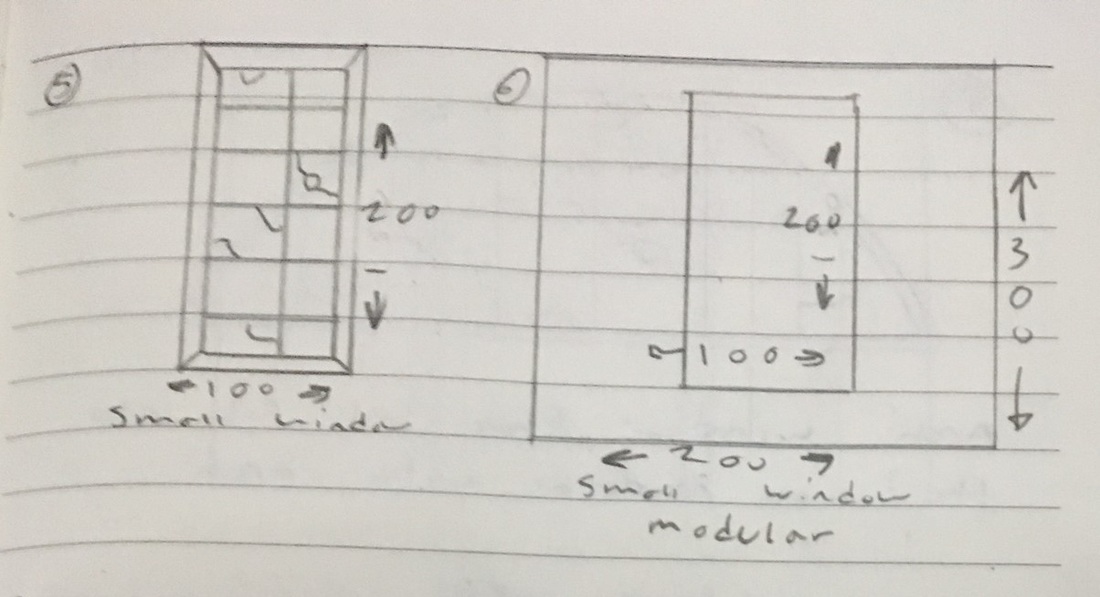
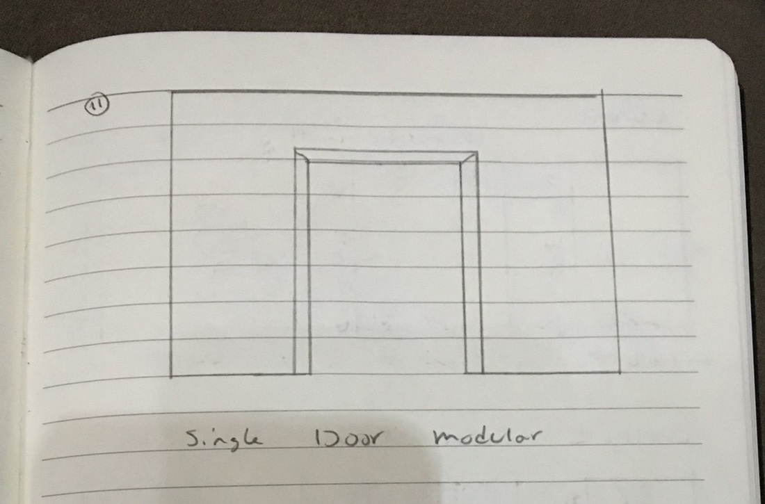
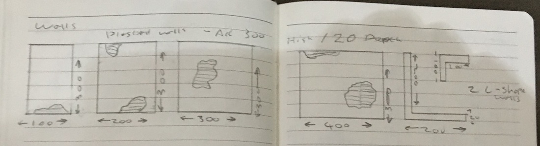
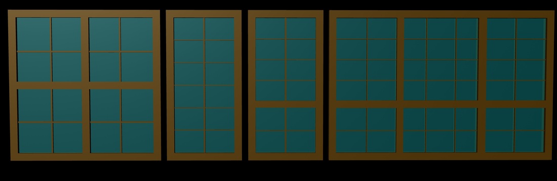
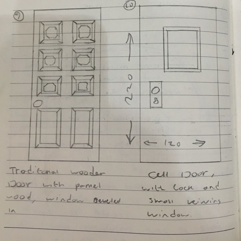
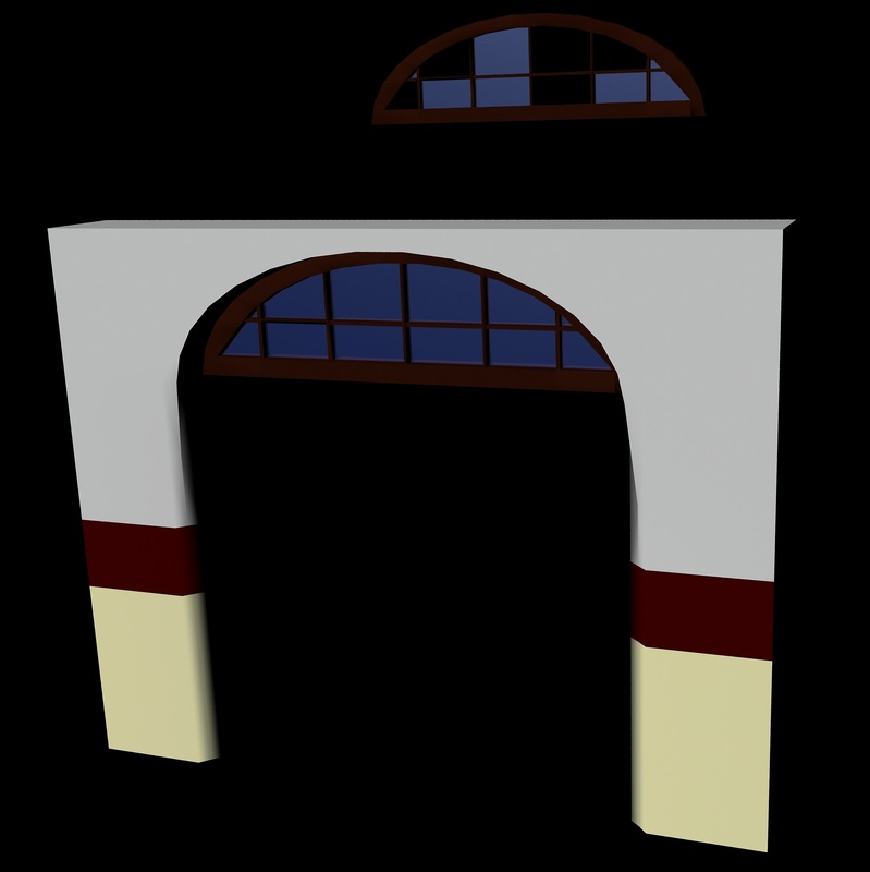
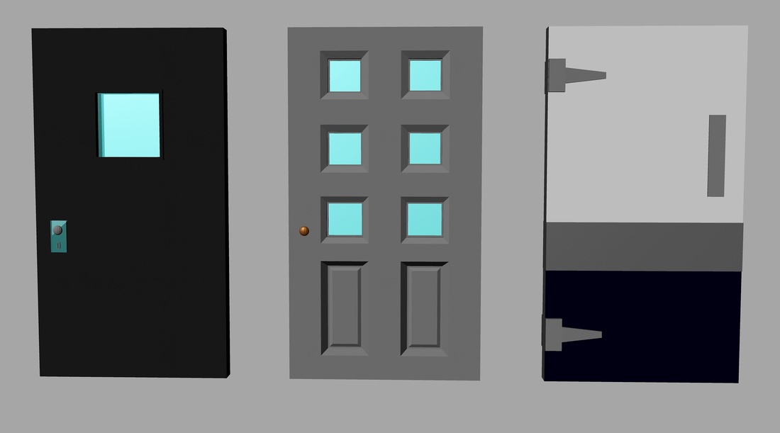
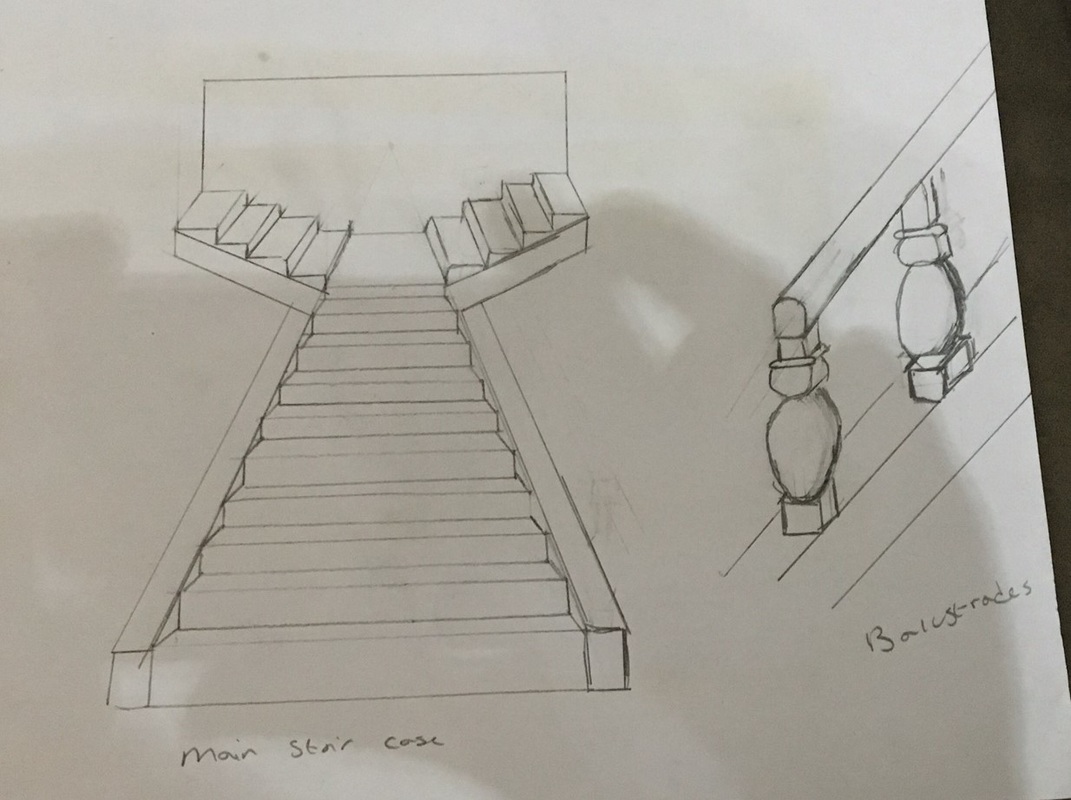
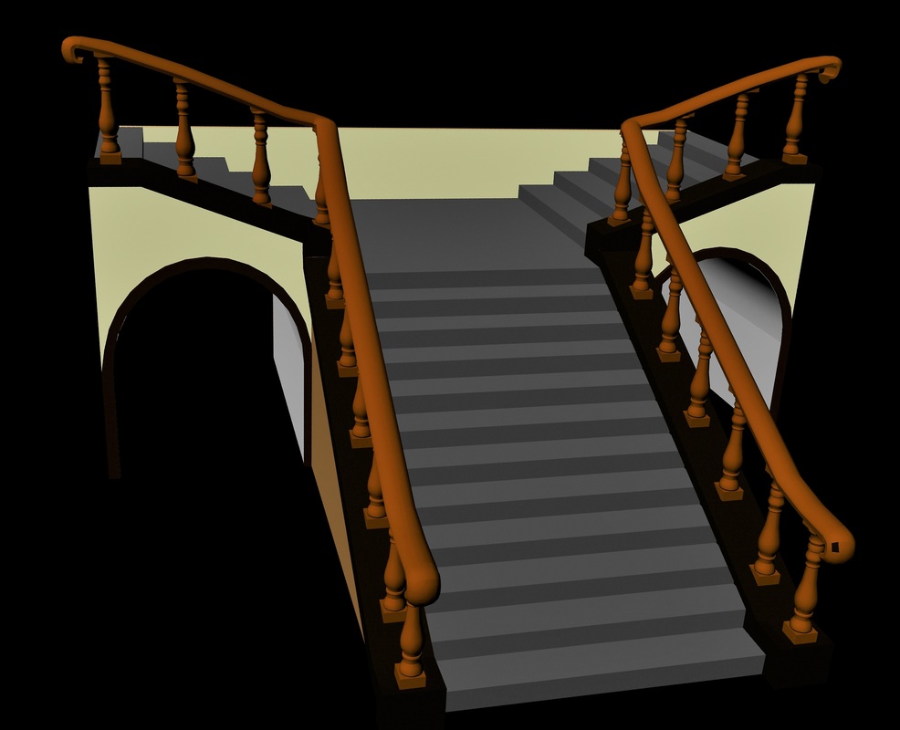
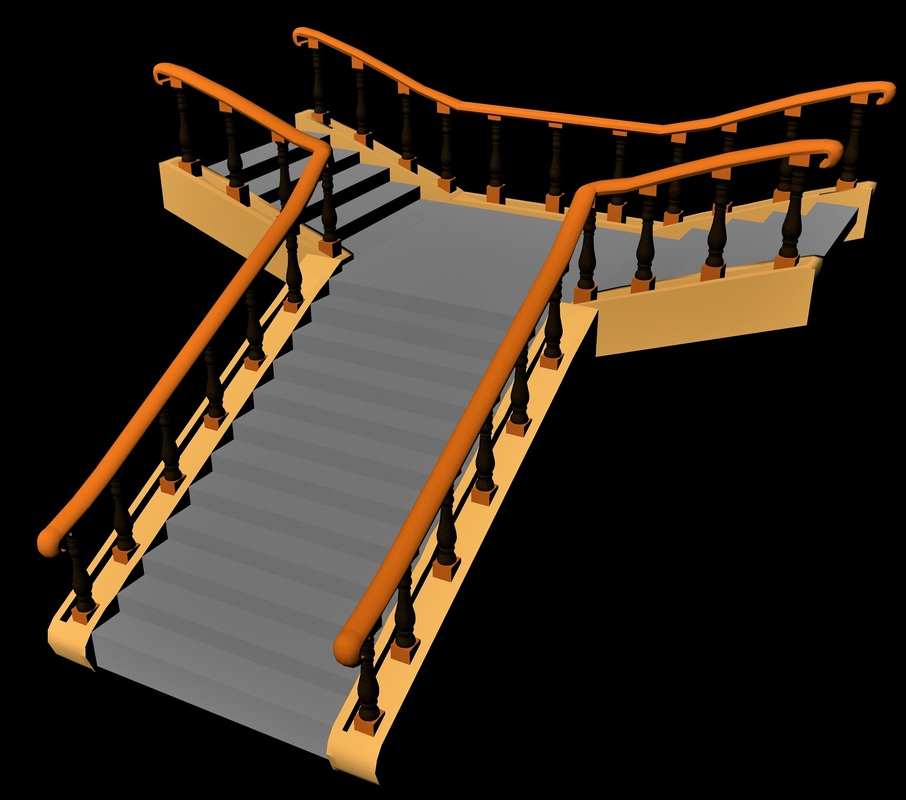
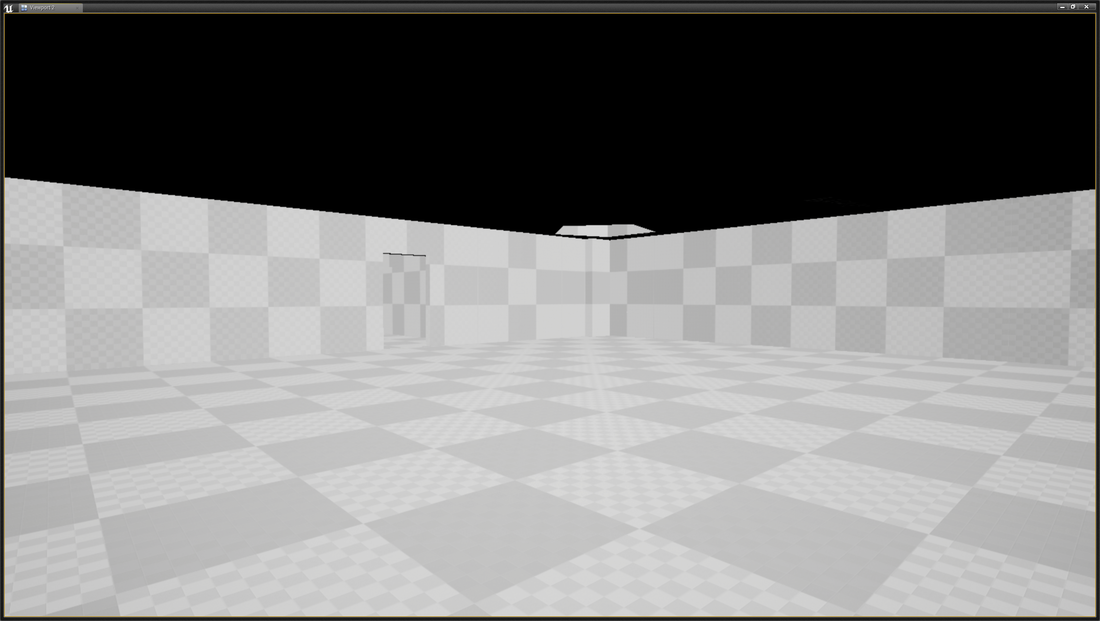
For unit 9 I had to conceptualize a modular pack (mainly walls, floors, doors, ceilings, etc.) that can be used in my asylum, from my concept drawing I then had to turn them into 3D models in Maya as shown below my drawings and the 3D version Walls and windows In the photos above, you can see the concept designs of simple walls with plaster damage, holes in for the doors and windows with windows that fit into the window spaces. in total I created 10 plastered wall, which come in 3 sizes small (100uu wide), medium (200uu wide) and large (400uu wide) I decided to leave the 300uu wide wall out as I felt it was unnecessary to have 4 different sizes of wall and would be hardly used. The medium and large walls were duplicated and had window and door sizes boolean out of them. in my concept, I only drew three different types of windows, small (100uu wide by 200uu height), medium (200uu wide by 200uu height) and large (300uu wide by 200uu height) which are made out of wood and have cracked glass. When I was creating them, I decided to make 3 extra once that would look like they are boarded up. I decided to do this as I wanted to make more of an illusion that the asylum is abandoned and make the level darker as I will be looking at having my player use a torch. The photos below show the final creation of the concept designs with out textures (only solid block colours) *note: I will be adding wall damages and crackers later on in the Texturing process Floors and ceilings In the photo above, you can see the concept for the floors, I decided to do two different styles of floors, wooden floor and ceramic floor titles both will be 400uu by 400uu. I decided not to concept draw the ceiling as I plan on it being a simple square with a plain texture on. The photos below show the final creation of the concept designs with out textures (only solid block colours) Archway and doors in the photos above you can see the concept designs for a modular archway with an half moon glass peice that fits in and double door that fits underneath, but can just be used by its self as an arch. three door designs whcih are cell, traditional interor door and an medical door all the doors as the same size (120uu wide by 220 height) and can be used as double doors by rotating the door 180 on its pivot so the handles will be in the middle. The photos below show the final creation of the concept designs with out textures (only solid block colours) Grand staircase in the photo above, you can see the basic concept design for my grand staircase when it goes up and splits off into two different directions and the style of balustrade I want for my staircase. After I created my staircase like in my concept I duplicated the model and adapted it so that it had archways under the stairs the split off to look like support columns you can walk through. I got this idea when I was creating the block out of my level and thought it would add a nice little finishing touch to my staircase on the ground level. Both sets of stairs will be split up into the 2 /3 sections for UV mapping, the bottom part of the stairs will be modular and the rest will be non modular and have the pivot point in the same place as the modular part of the stairs so it will connect perfectly when in unreal engine. The photos below show the final creation of the concept designs with out textures (only solid block colours) Conclusion
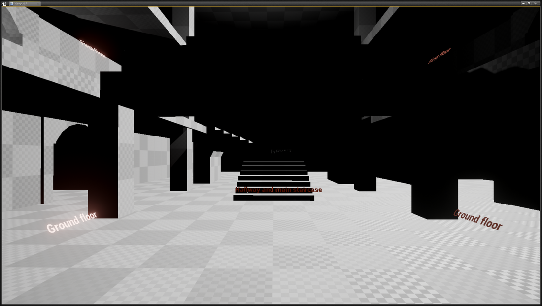
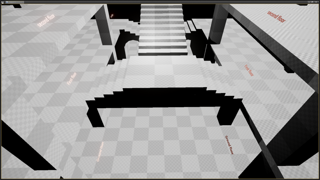
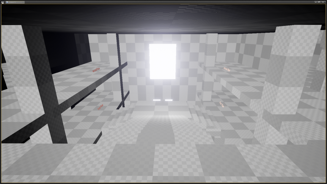
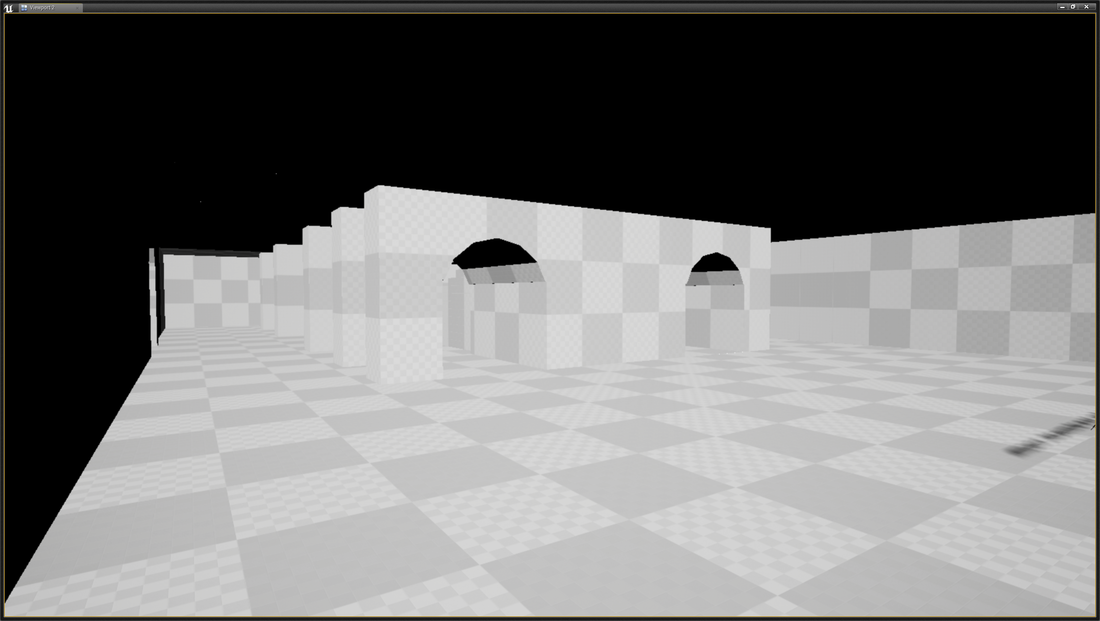
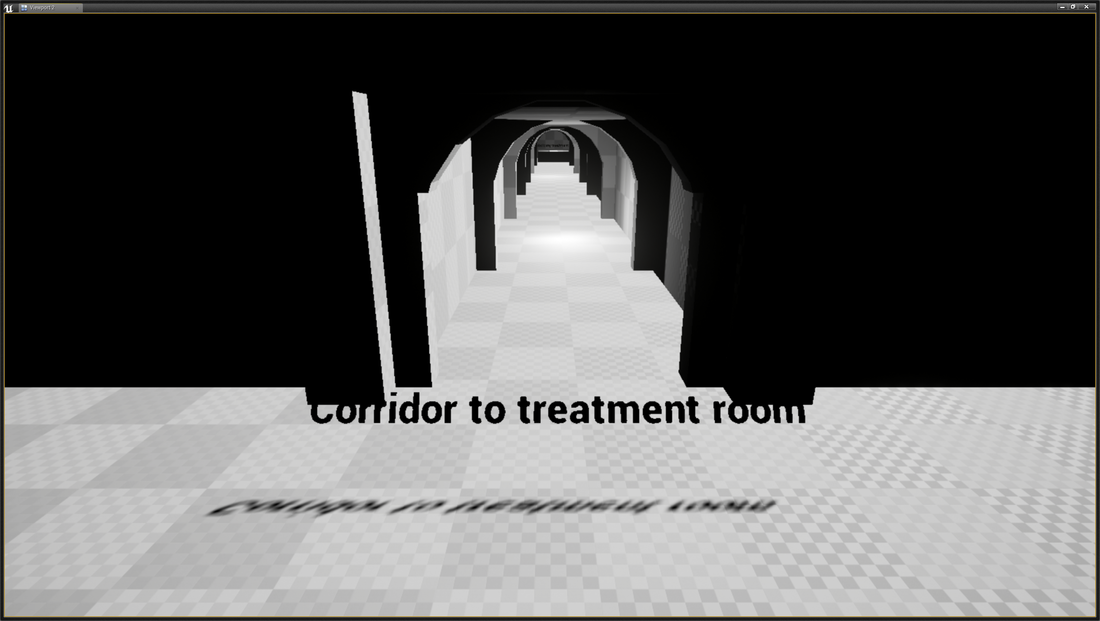
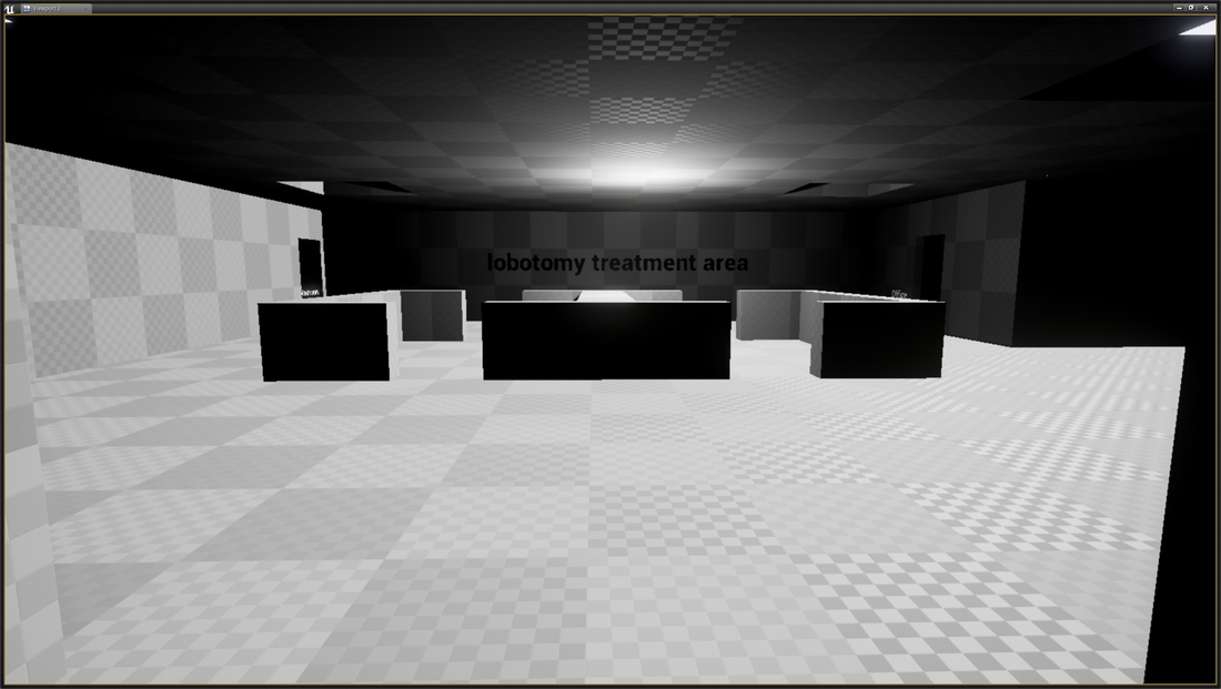
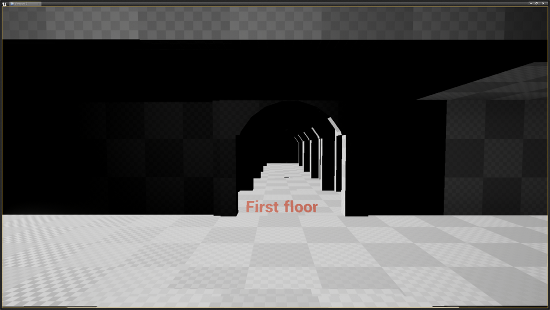
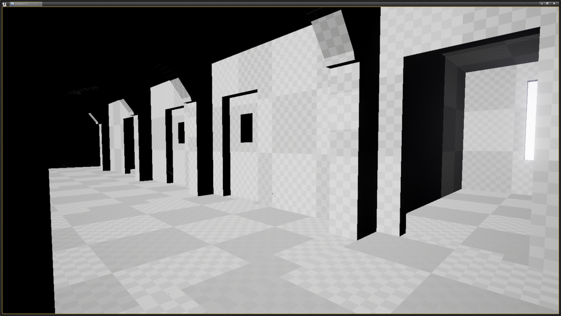
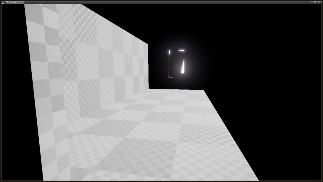
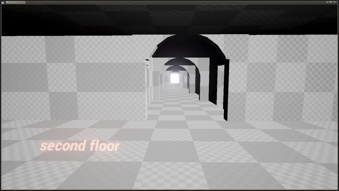
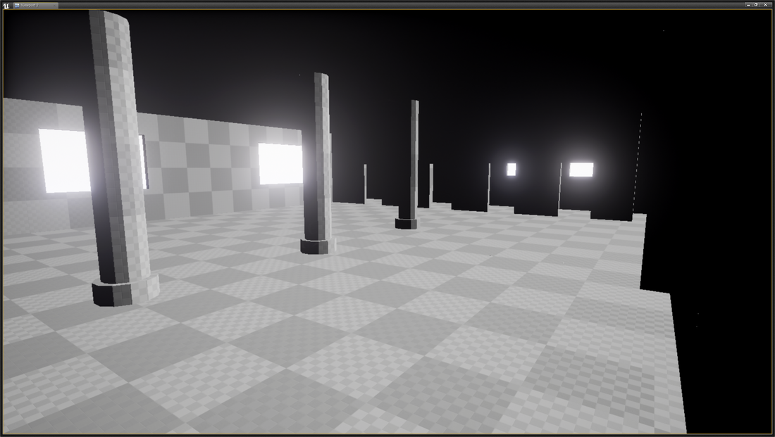
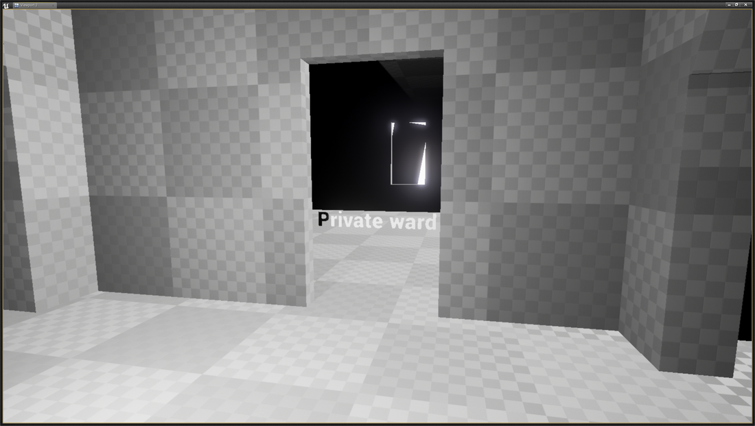
To conclude now that my concepts have been created I now need to do the following with each model to make them ready for them to be used in unreal engine: Snap the pivot points to the grid, create UV maps, Light maps, collision boxes and a tillable textures Here are some screenshots taken from the level i created with the bsp gemotry in unreal based of my blueprints My next task in unit 9 was to design blueprints based on my research into psychiatric hospitals. My blueprints have to be scaled into centimetres that can be converted into unreal units, once my blueprints are complete I will have to block out the blueprints into the unreal engine using the game engine geometry, this would have to be done by size that I noted in the blueprints and will look almost identical to the blueprints. I decided to do a 3 storey building, with a male and female wing, long corridors, merge, cells, wards, treatment rooms, dining halls, etc., the rooms come in different sizes and want to make the player feel like they are walking around a maze of rooms, I also decided to include three staircases one main and two smaller ones on each wing of the hospital. The hospital will be inside only and will only feature a small glimpse of outside thought the windows either be a bit of a tree or the sky, as I want to try to keep the level dark and gloomy to add a bit of fear factor to it. You can see the 3 floor plans I drew for my abandoned hospital below Ground floor 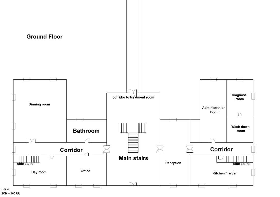 Ground floor continued 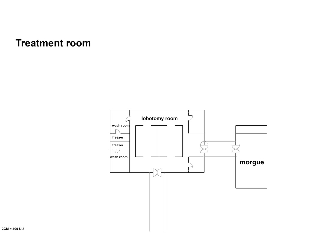 First floor 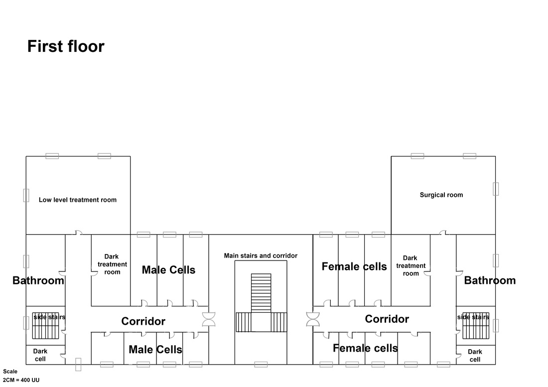 Second floor 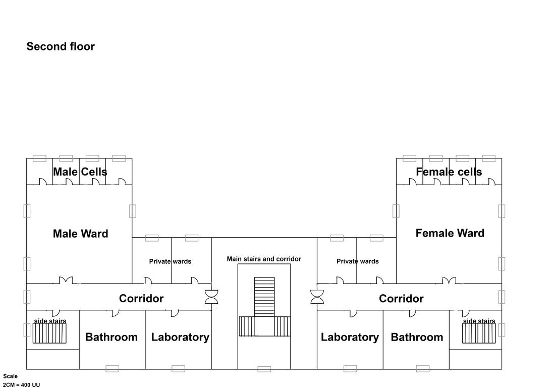 For unit 9 I have created two mood boards based on my Pintrest research and personal reference material. the first one I created is mainly about the theme, style and era I wanted to base my abandoned psychiatric hospital on and the second mood board I created was based on the interior style and type of props I want to use in my modular pack/level. 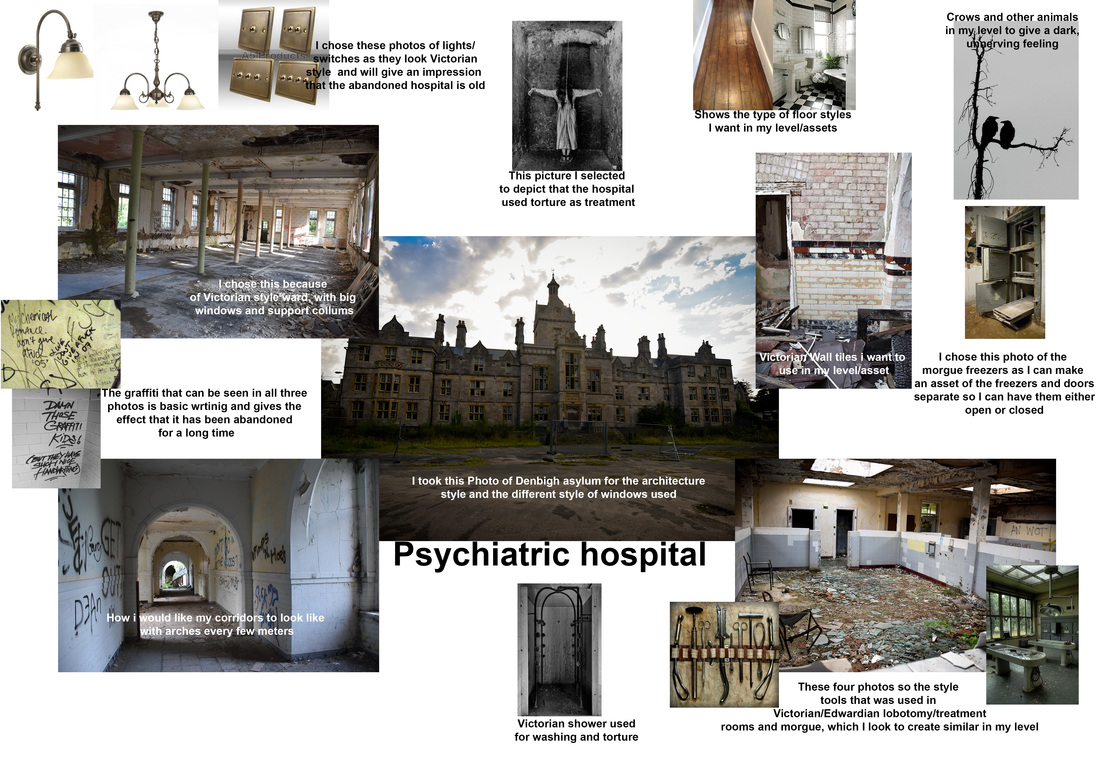 Below is a word document of the links of the photos used in my mood board
 Below is a word document of the links of the photos used in my mood board for the interior
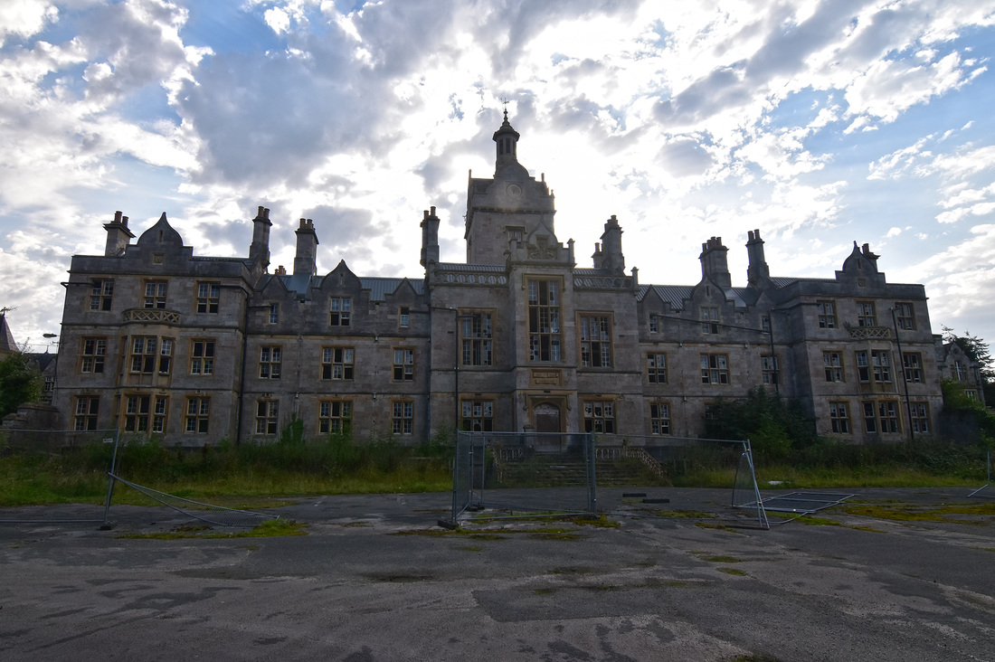
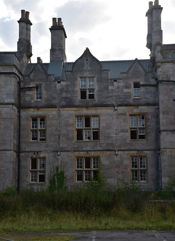
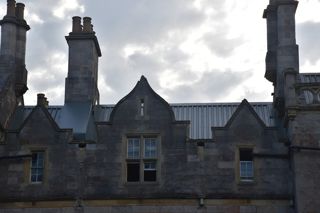
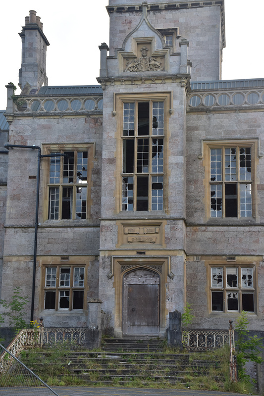
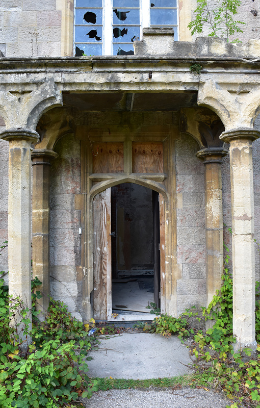
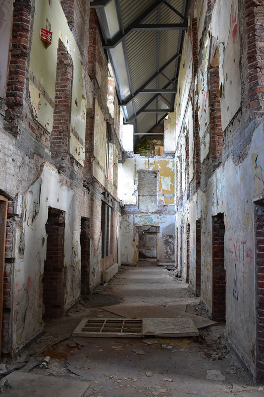
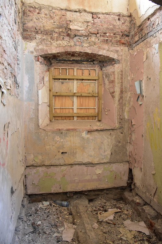
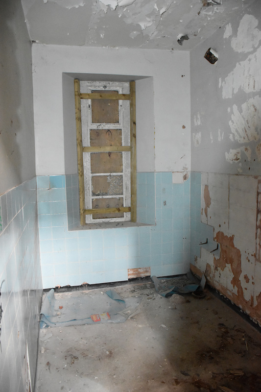
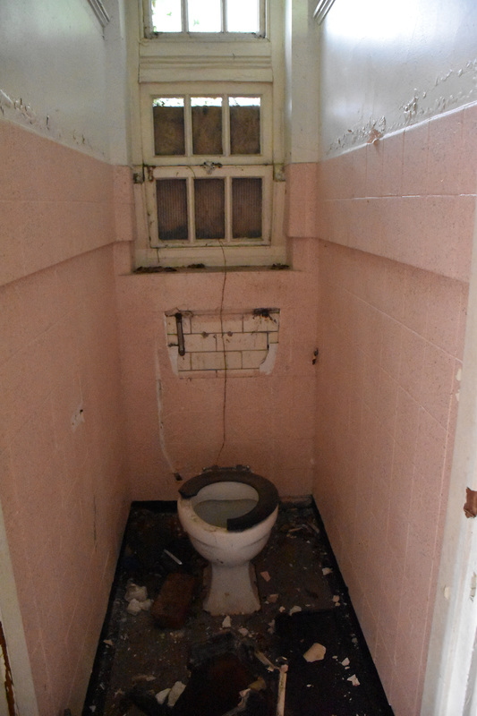
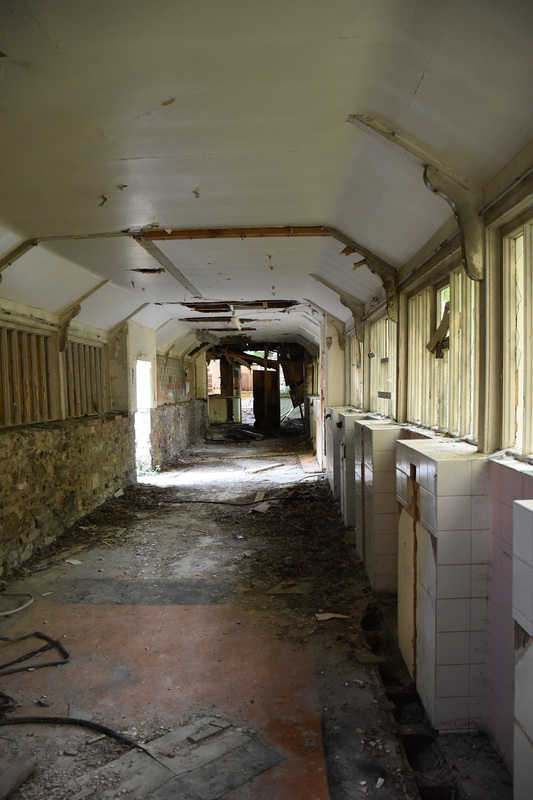
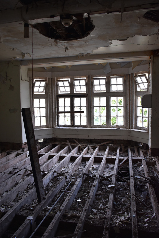
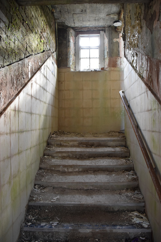
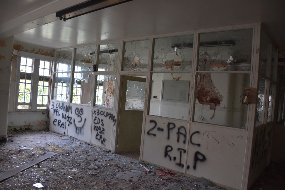
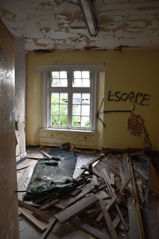
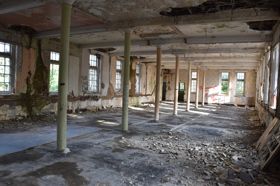
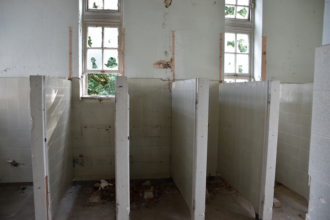
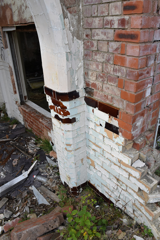
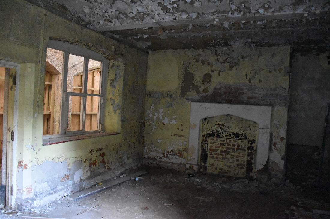
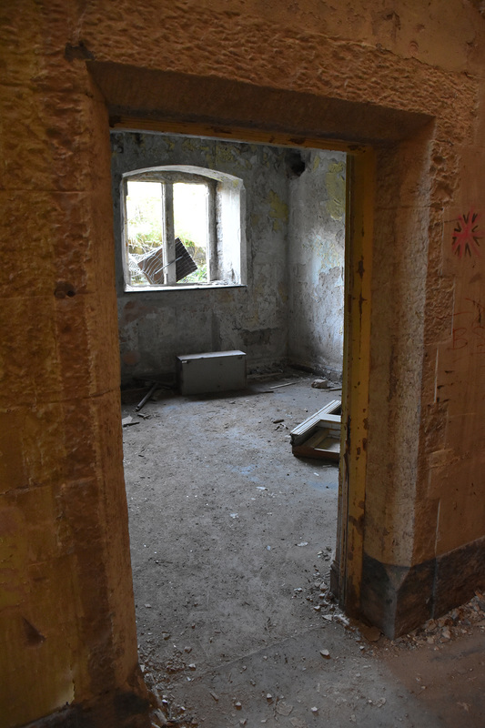
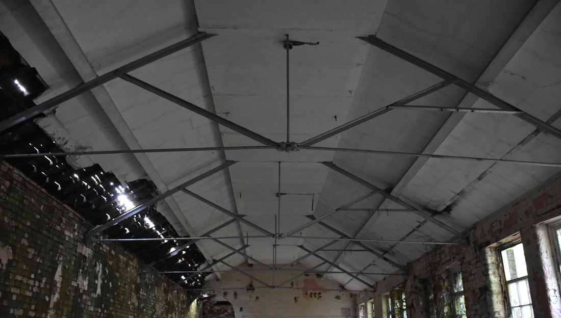
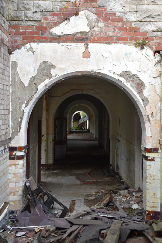
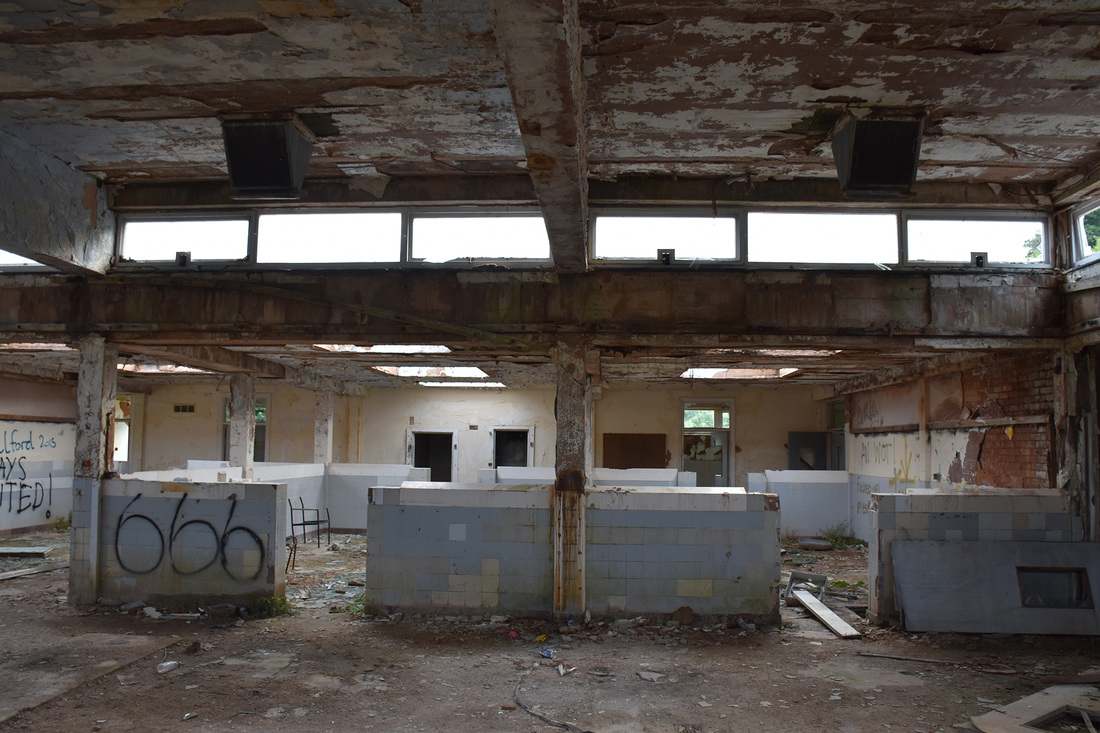
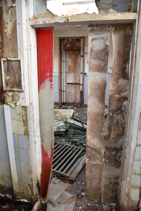
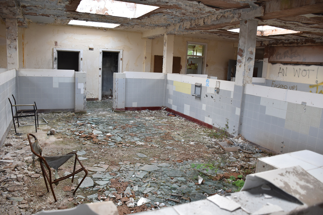
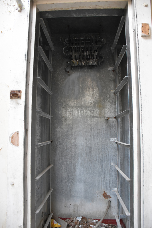
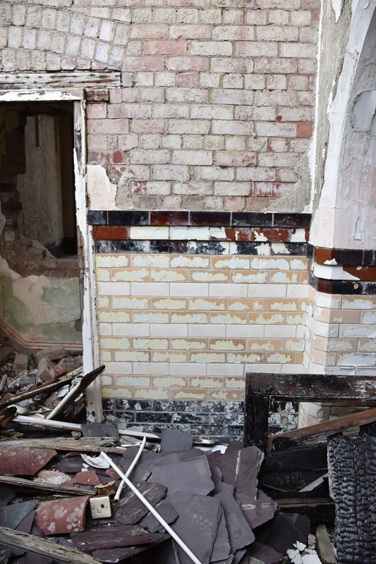
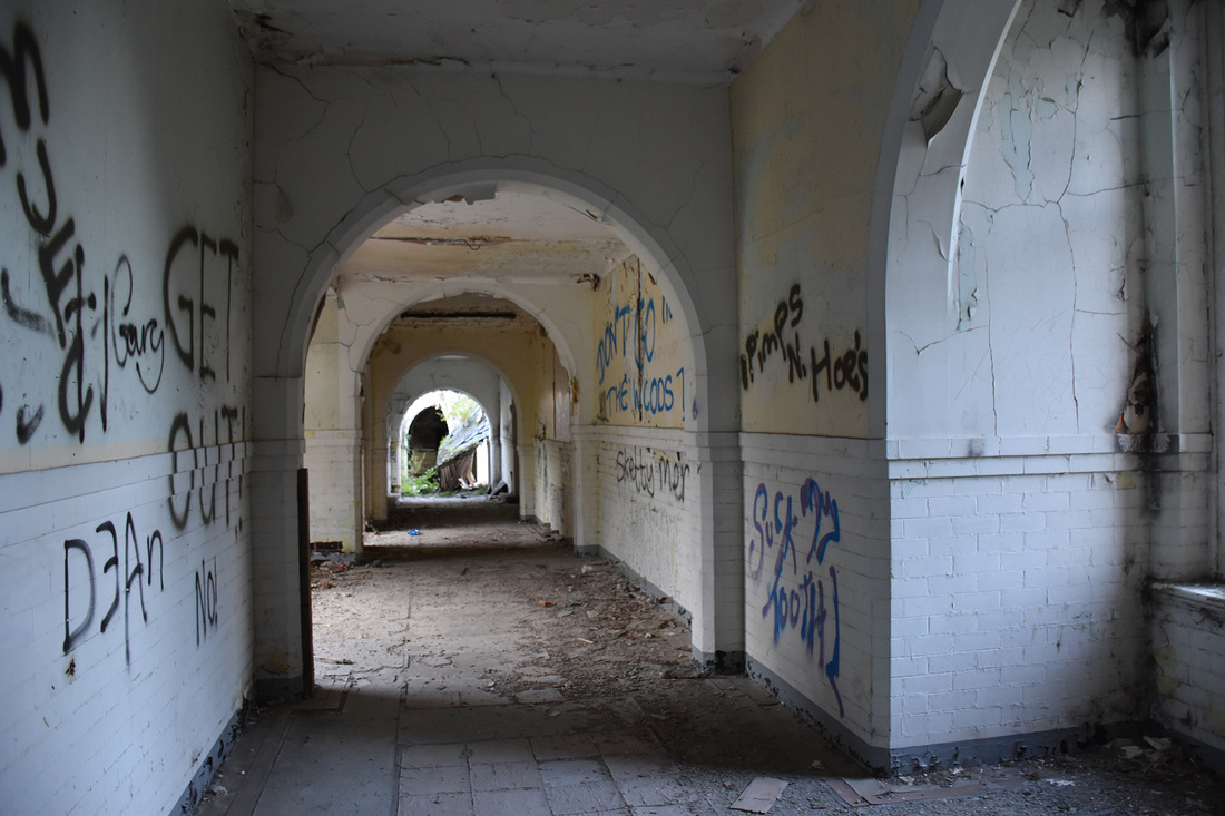
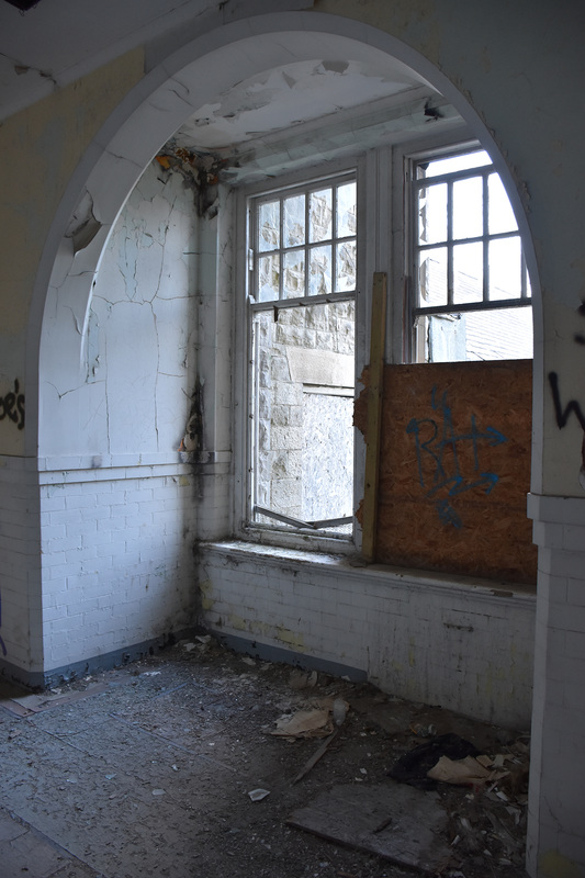
I wanted to get some personal reference material of abandoned hospitals/asylums so I searched the local area and found that there was an abandoned asylum not far from me. The photos below are what I photographed when I went and visited Denbigh Asylum.
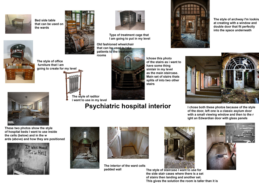
Exploring the grounds gave me loads of ideas for artists and how I want my level to look and the design and style that I am after. After getting these ideas I made a board on Pintrest and found images relating to my ideas. You can see my pintrest board below the gallery from Denbigh Asylum. I was given a task of designing 42 props (assets) to be used within a level that I will create in unreal engine. We were given a brief; the theme would be horror survival, e.g. hunted house type of level. I started off by brainstorming the theme that surrounds the haunted house idea and the type of places that could be scary. In the photo below you can see the ideas I came up with for the themes and the type of places that I thought could be linked to a horror survival 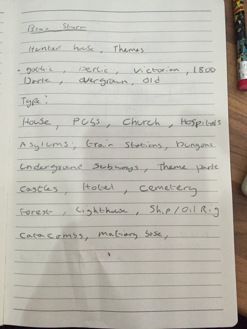 After great thought, I decided to base my horror survival level in a hospital/asylum type of building. I decided to choose this theme because of the wide range of aspects I could follow within the hospital/asylum genre. E.g. wards, test labs, surgical room/equipments or something even darker! In the photo below was a quick mind map I made of the themes, props (assets) and areas that I associate with abandoned hospitals/asylums 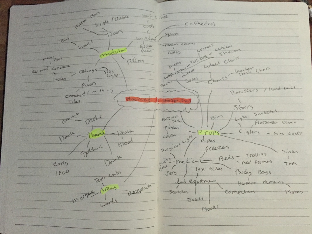 In the photo below is the list of props (assets) I am contemplating making for my horror survival level. 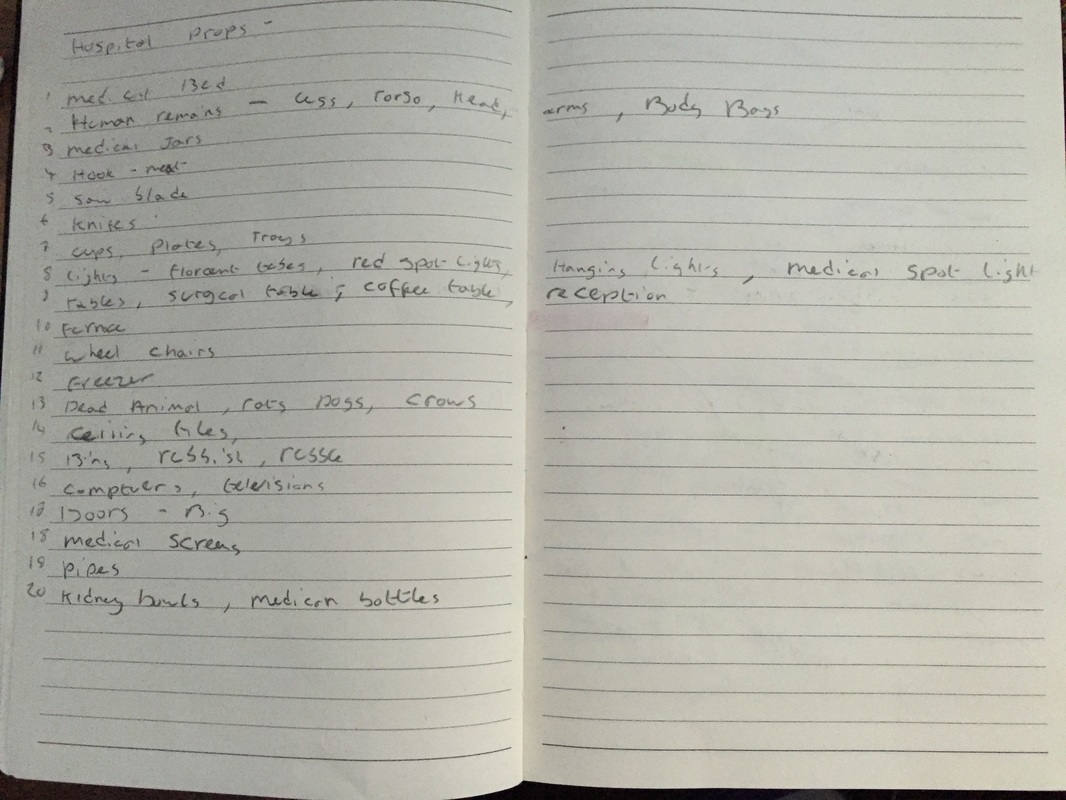 The final digital version of all the brainstorming and mind maps combined 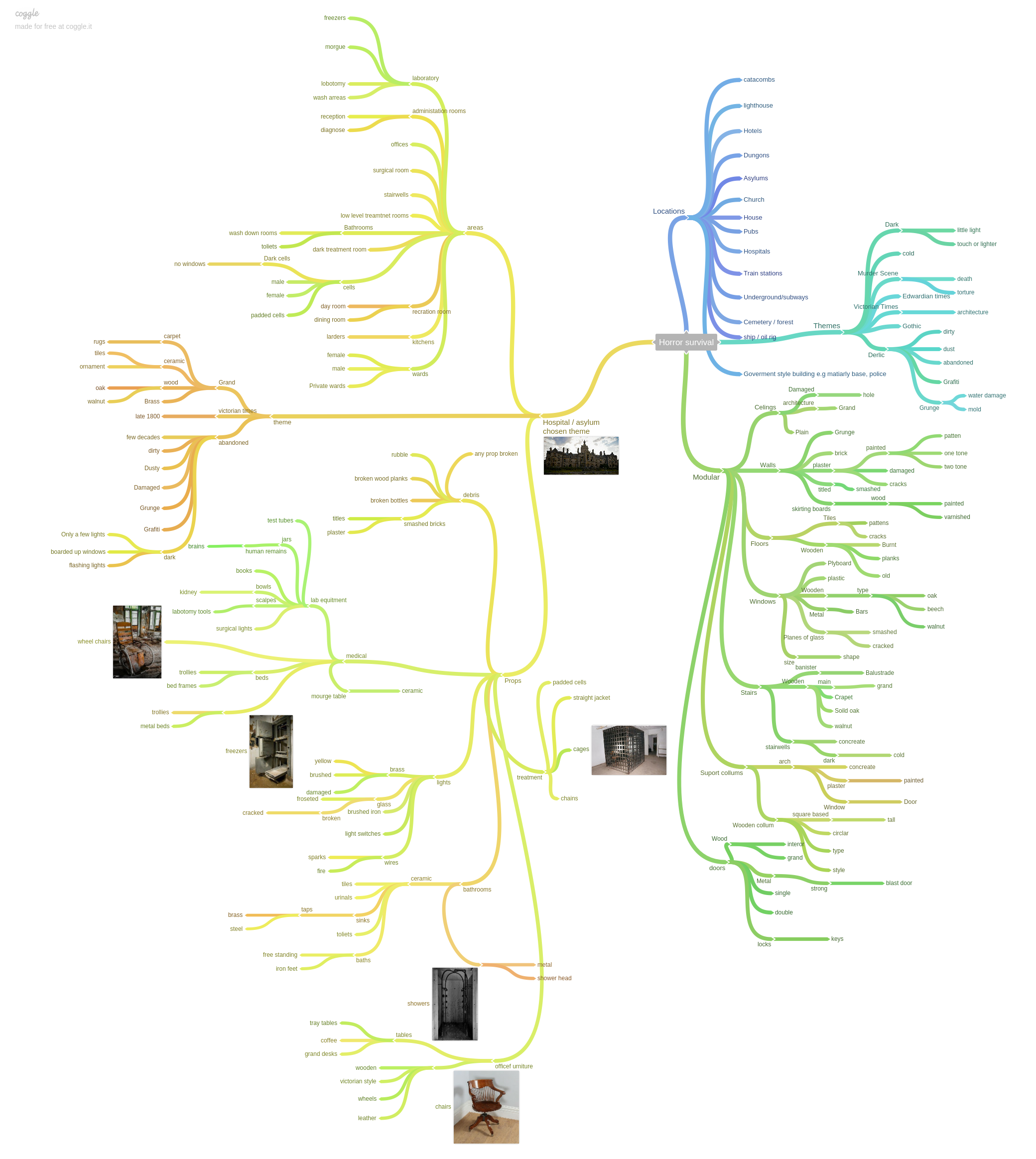 |
AuthorWelcome to my blog about my game design and 3D modelling work Archives
December 2016
Categories |
||||


 RSS Feed
